

Nicola Goodwin

03 — Motimatic

One brand for a company that had grown into a platform

RoleBrand direction & design
Years2024–2025
ScopeGuidelines, sales deck, website, landing page
SectorEdtech: enrollment & retention
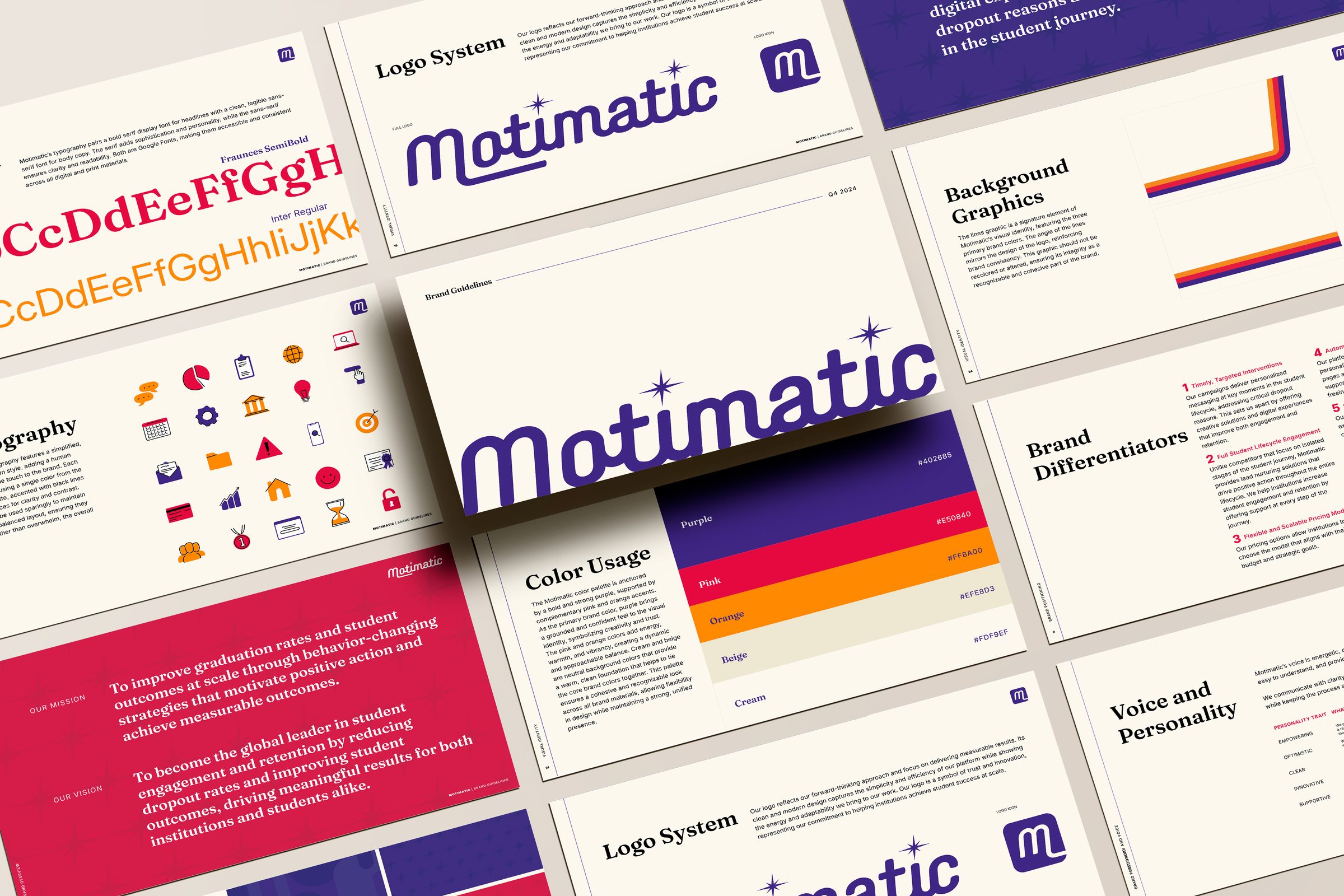
Pages from the Motimatic brand guidelines laid out at an angle: logo system, type, color, icons, mission
The guidelinesA rewrite of the brand, not a refresh: who Motimatic is, how it speaks and how it looks, rebuilt for the platform it had become.

Motimatic helps colleges keep students enrolled, and by 2024 it had grown from an ad campaign provider into a full platform. I rebuilt the brand to match, with new guidelines, a sales deck and a website, and a landing page for students that plays like an app.

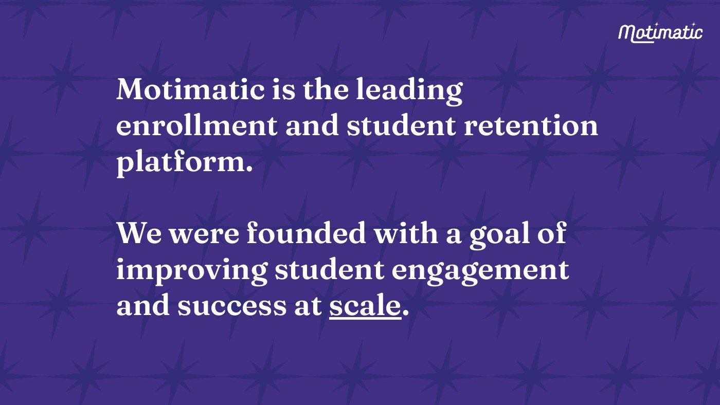
Sales deck — Motimatic is the leading enrollment and student retention platform
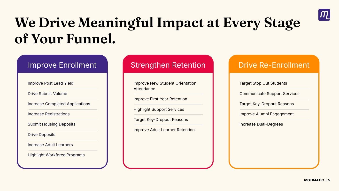
Sales deck — meaningful impact at every stage of the funnel
Sales deck — the average adult spends 900 hours a year on social media
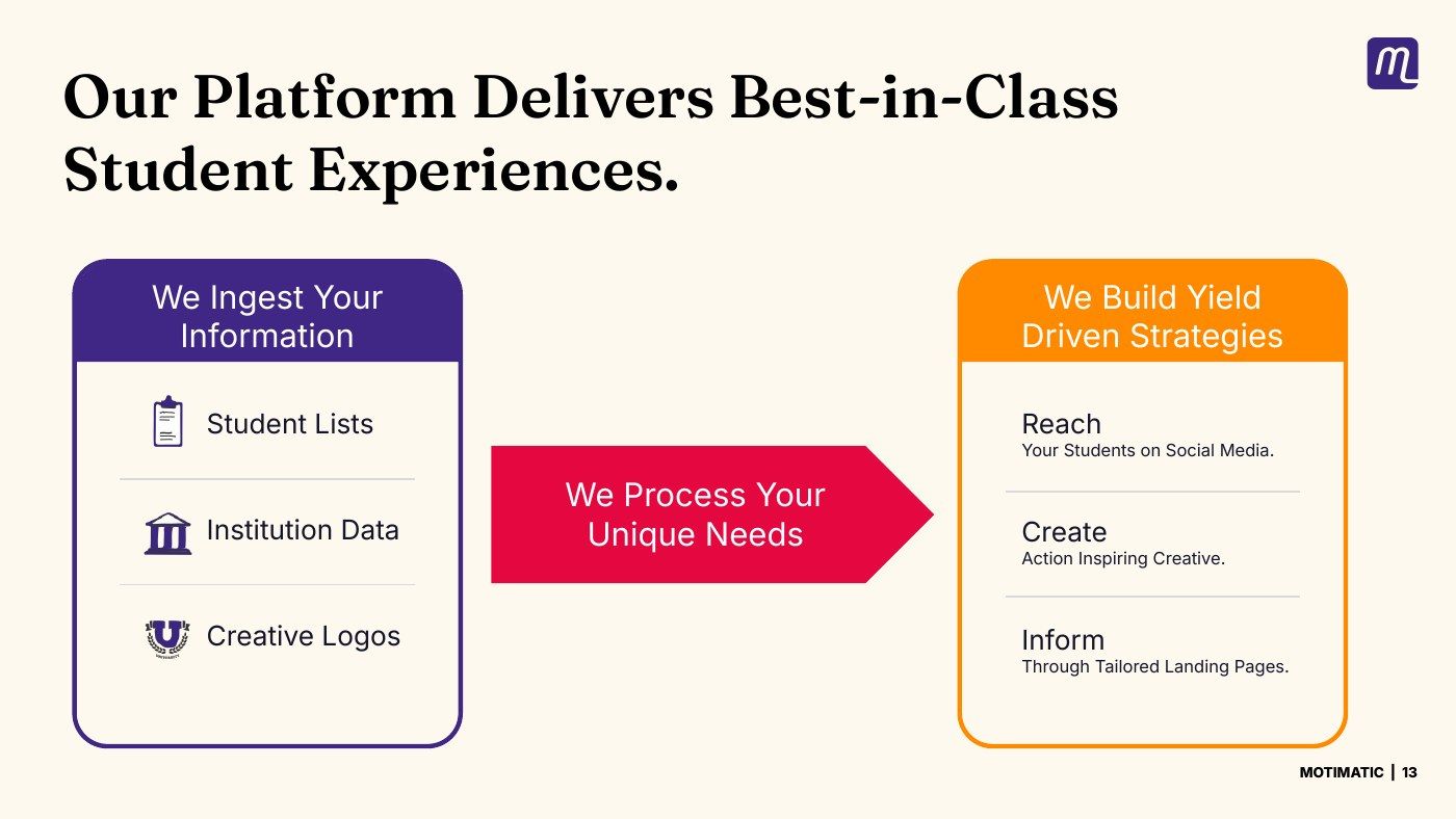
Sales deck — best-in-class student experiences
Sales deck — Inform, through tailored landing pages
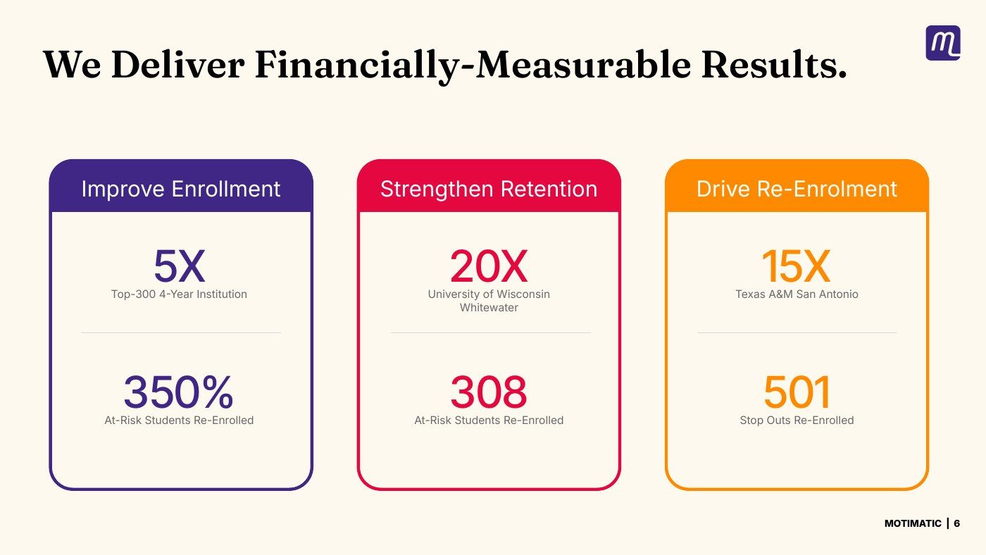
Sales deck — we deliver financially measurable results
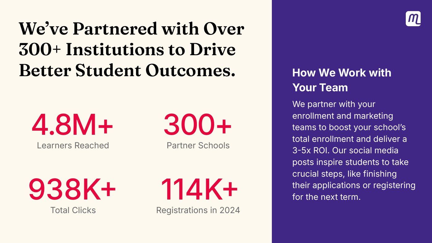
Sales deck — 300+ partner institutions
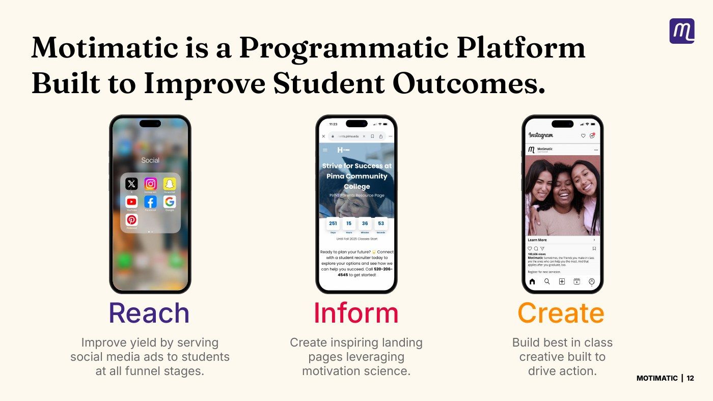
Sales deck — Reach, Inform, Create: the platform on three phones
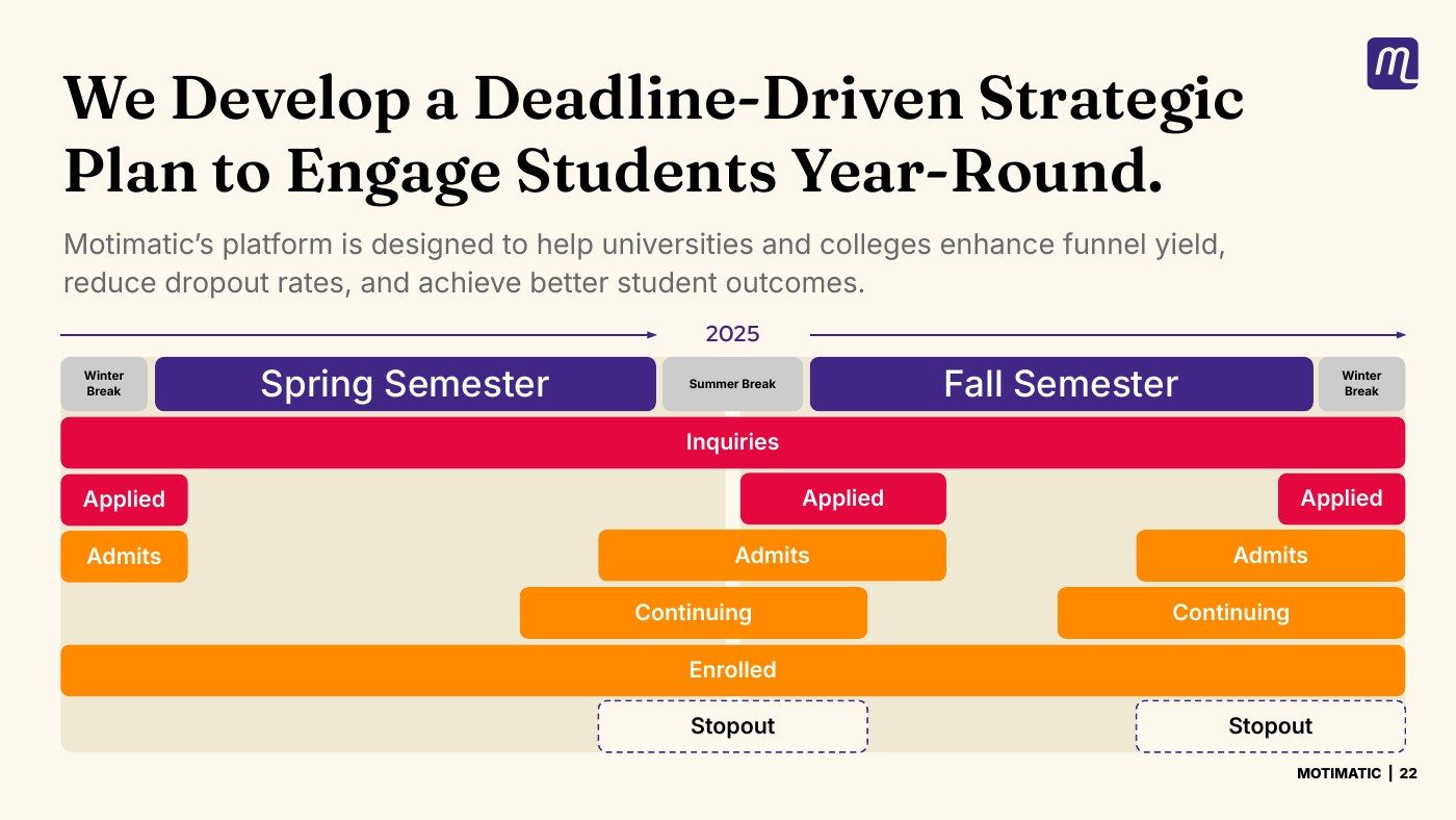
Sales deck — a deadline-driven plan for the student year
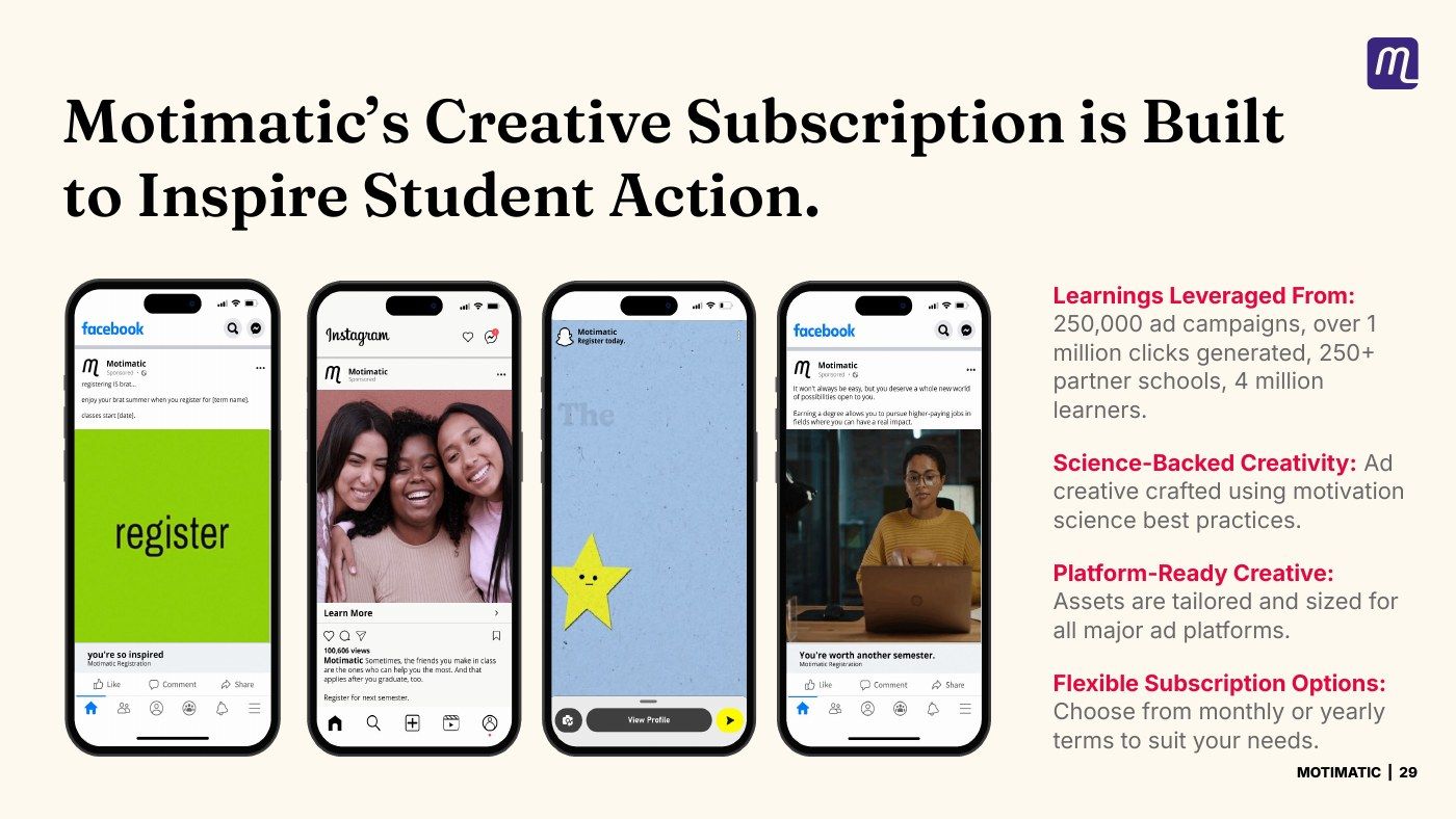
Sales deck — the creative subscription

The sales deckFifty slides, every one built from the new guidelines: the same purple, pink and orange, and the same serif.

01Brief

The problem

Motimatic uses behavioral science to keep students in college. It times ads, landing pages and messages to the moments when students are most likely to drop out. It made its name on smart, targeted campaigns. By 2024 it was selling something bigger — a platform that works across the whole student journey, from enrollment to graduation, on longer contracts.

The brand had to sell the bigger thing, and it had to work for everyone who would be selling it, like the sales, marketing, product and customer success teams, so that a college heard the same company from all of them.

And it had two audiences who want different things. The people who buy Motimatic are enrollment heads and deans signing multi-year contracts. The people who see its work are eighteen-year-olds on their phones.

02Solution

The solution

Half the guide is words

Brand guidelines usually mean logos and colors. Half of these are about language: who Motimatic is, its mission and vision, its differentiators and value propositions, a voice with rules about what it does and doesn’t sound like, tone by channel, and messaging pillars a salesperson can lift straight into an email.

That half is what keeps the rest consistent. Four teams were going to describe the same company to the same colleges, so the guide had to give them the sentences, not just the fonts.
The logo stayed. The system is new.

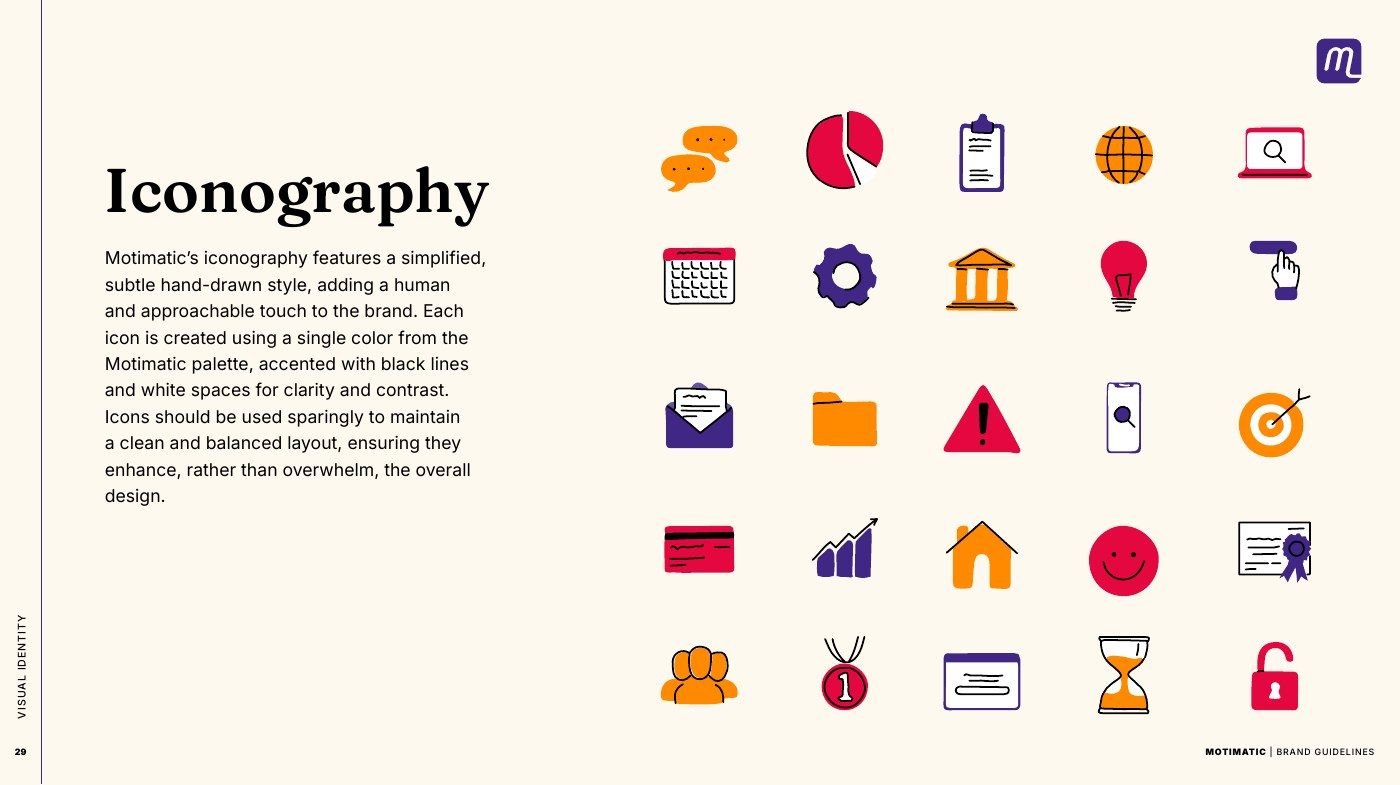
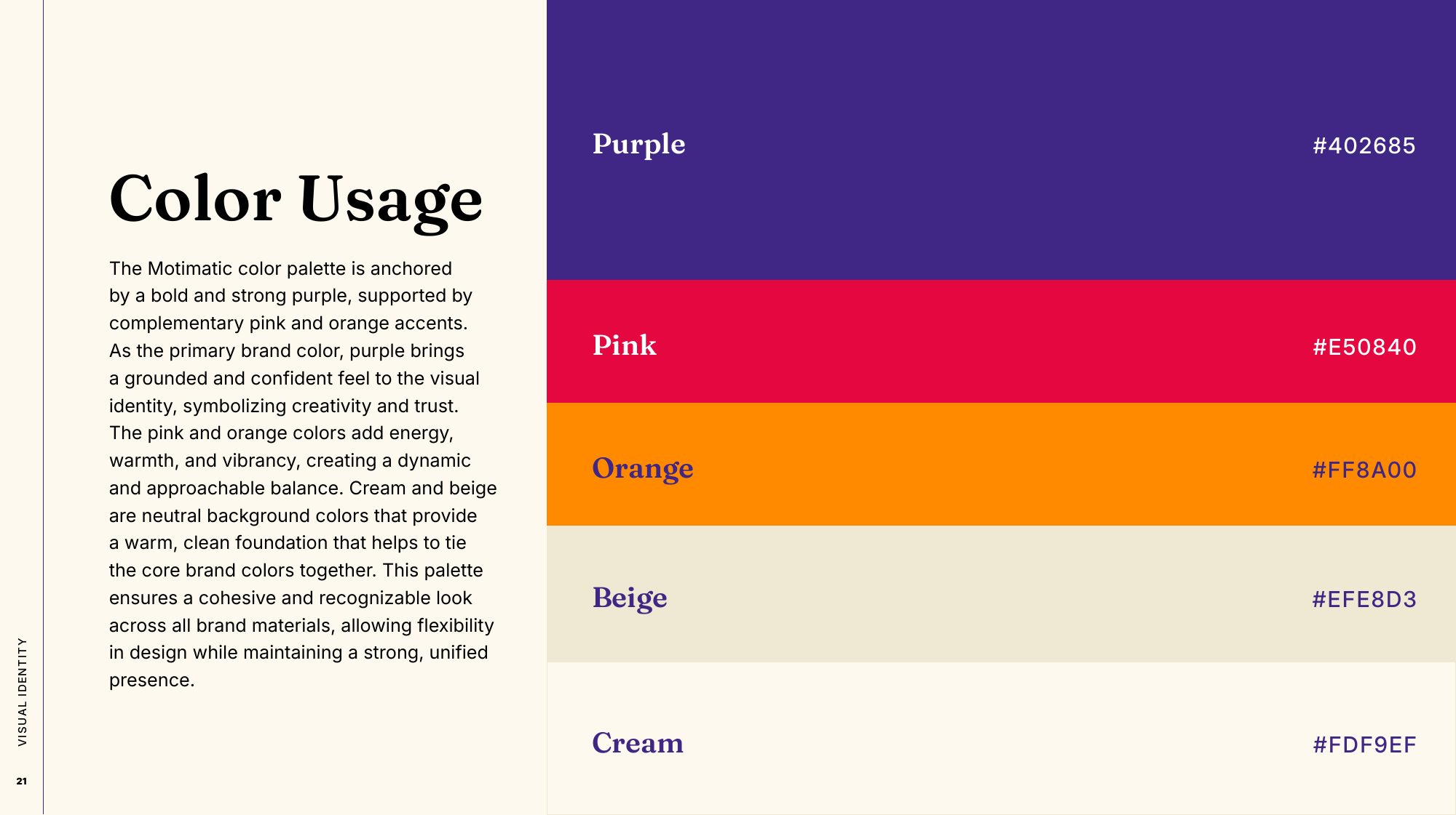
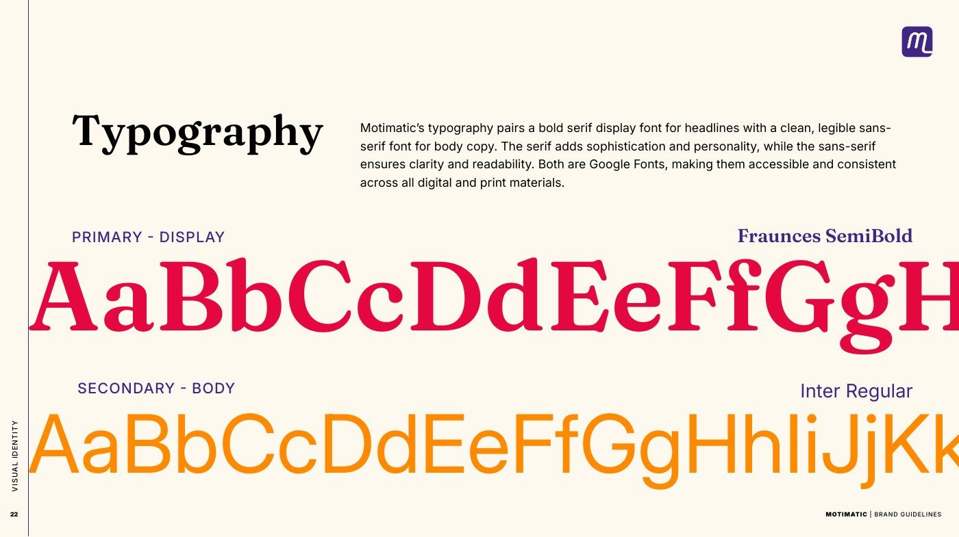
Motimatic kept its wordmark. Around it: a palette anchored in a deep purple, with pink and orange for energy; Fraunces, a serif with personality, for headlines and Inter for everything else; a stars pattern and an oval pattern; a lines graphic that takes its angle from the logo; a photo treatment and a hand-drawn icon set.

The purple and the serif carry the authority an administrator expects. The pink, the orange and the hand-drawn icons carry the warmth students need to see. One brand, holding both audiences.

Guidelines page: color usage, purple, pink, orange, beige and cream with their values
Guidelines page: Fraunces SemiBold for display, Inter for body
Guidelines page: the hand-drawn icon set

The visual systemThe palette, anchored in purple, the type pairing, and the icons: one color each, with black linework.

A deck that opens on the problem

I worked directly with Motimatic’s CEO to rebuild the sales deck in the new brand. He brought the numbers and the message. I shaped the story: what the deck says, in what order, and how every figure and claim is shown.

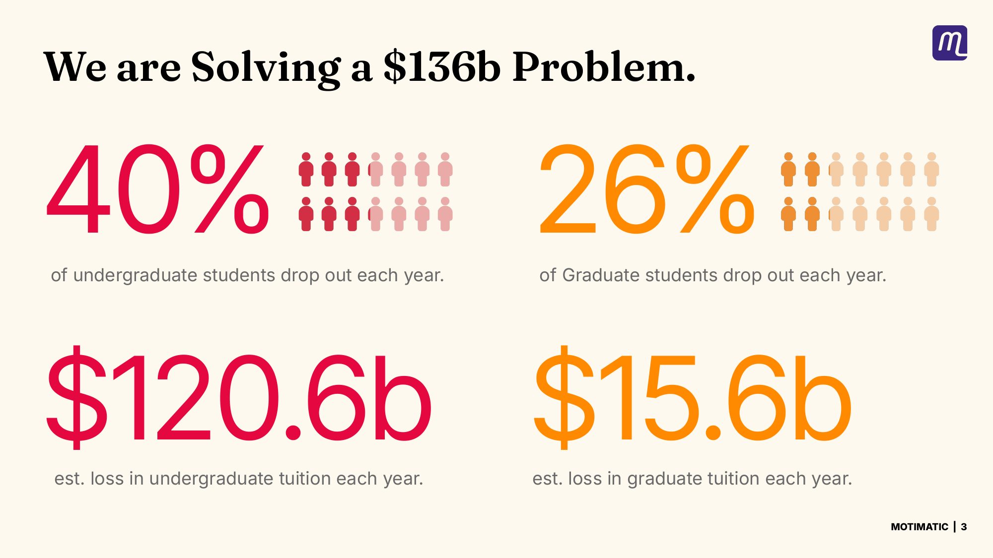
It opens where a college’s finance office would: forty percent of undergraduates drop out, at an estimated $120 billion a year in lost tuition. Then the results at partner schools, a tour of the platform, the creative it makes, case studies, and a worked example of the return a college could expect.

It was also the first test of the guidelines. Fifty slides, every one built from the parts in the guide.

Sales deck: We are solving a $136b problem — dropout rates and lost tuition
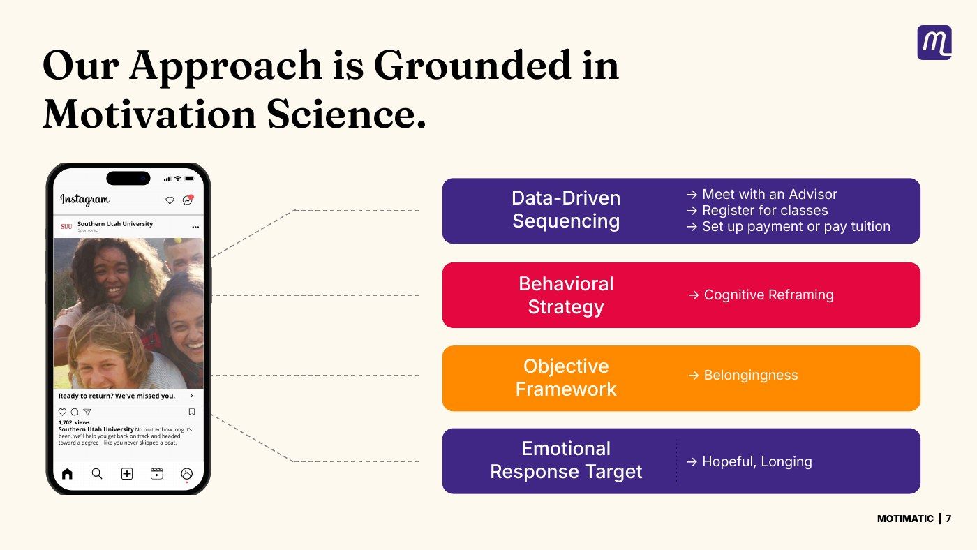
Sales deck: our approach is grounded in motivation science
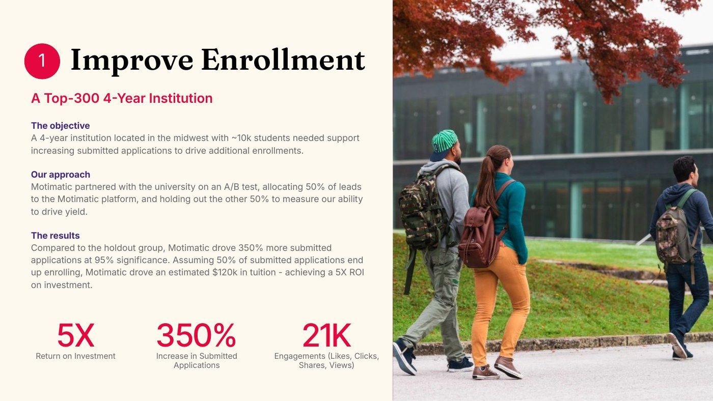
Sales deck: case study, improving enrollment at a top-300 four-year institution

The sales deckThe problem in numbers, the behavioral science behind the platform, and a case study. Figures are Motimatic’s. More of the deck on the decks page →

A website that sells the platform

The website had to sell Motimatic as the platform it had grown into, not as a single product. That meant carrying everything the rebrand changed: the visual identity, and just as much the voice, the tone and the way Motimatic described its platform and sold it to colleges.

The pages lead with the platform and the proof behind it, in the same language as the guidelines and the deck.

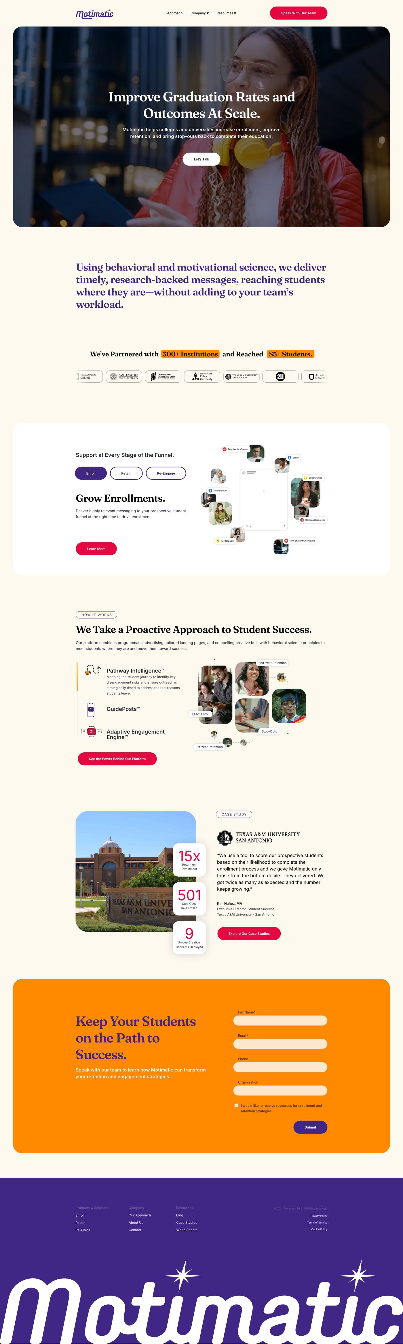
The Motimatic home page: improve graduation rates and outcomes at scale, partner institutions, support at every stage of the funnel, a proactive approach, a case study and a contact form
Home
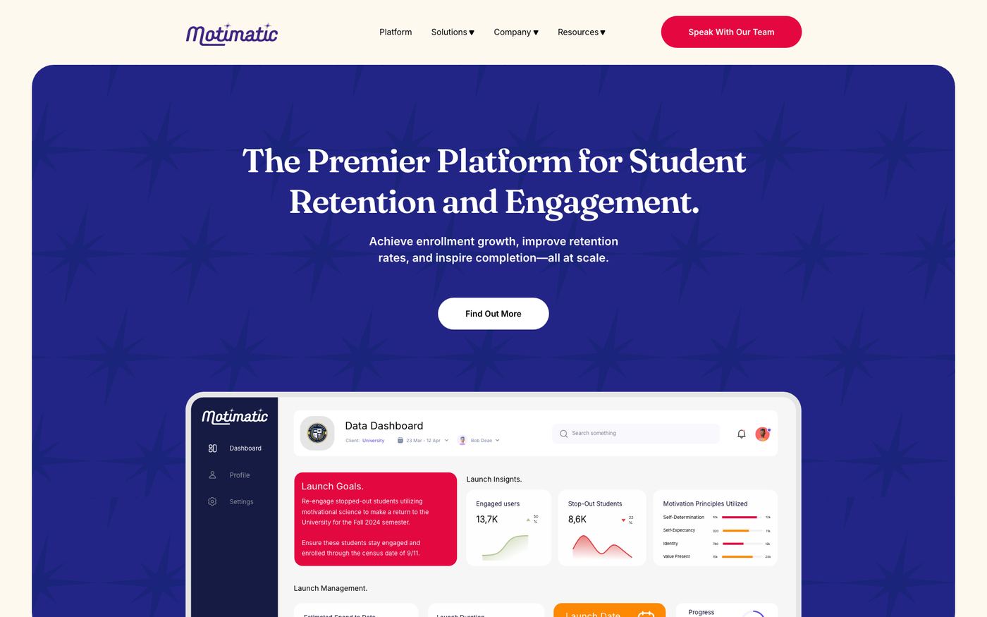
The platform page: the premier platform for student retention and engagement, with the dashboard
Platform
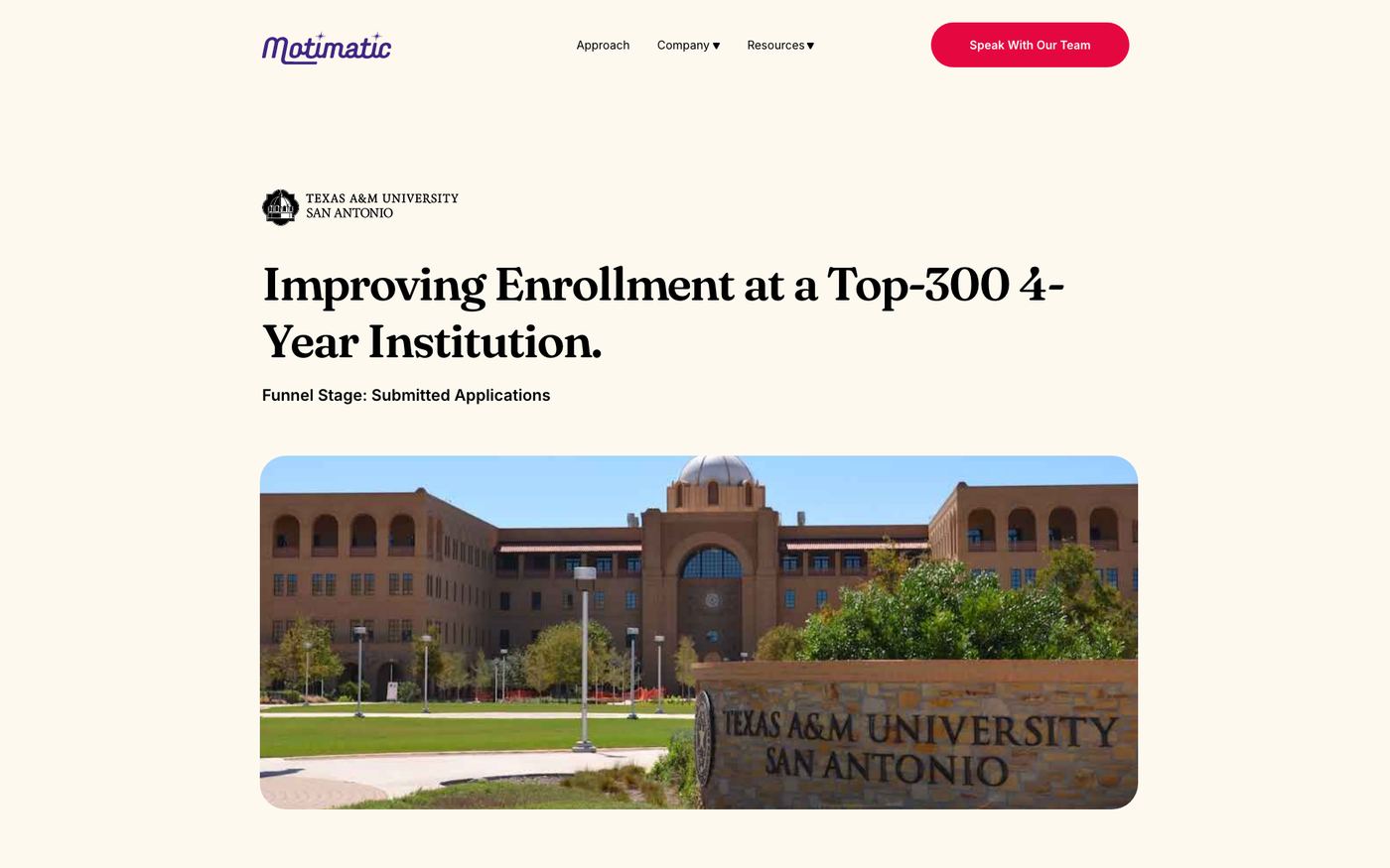
A case study page: improving enrollment at a top-300 four-year institution
Case study

A landing page that plays like an app

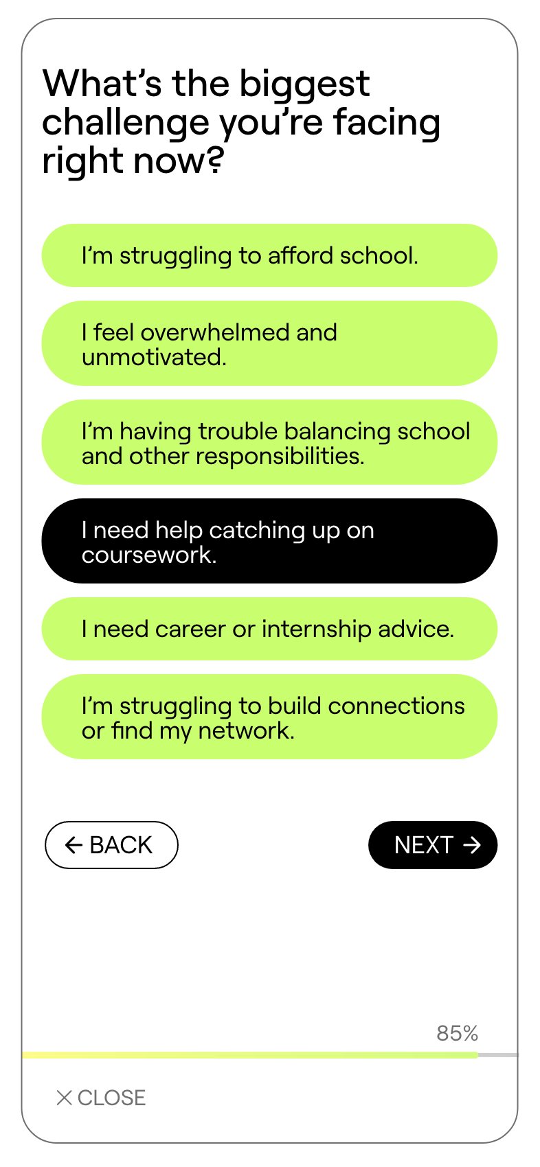
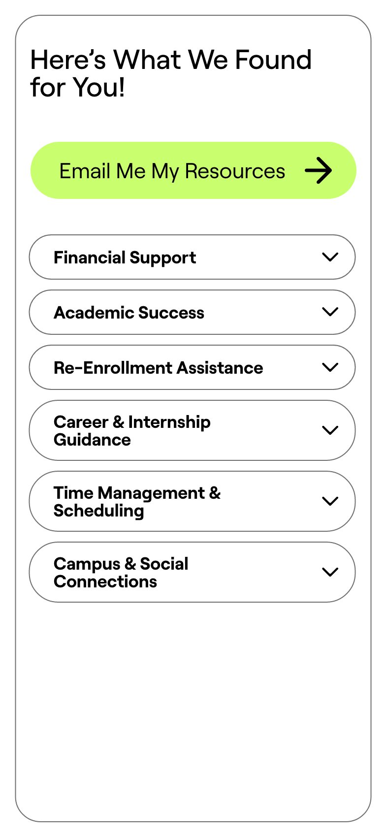
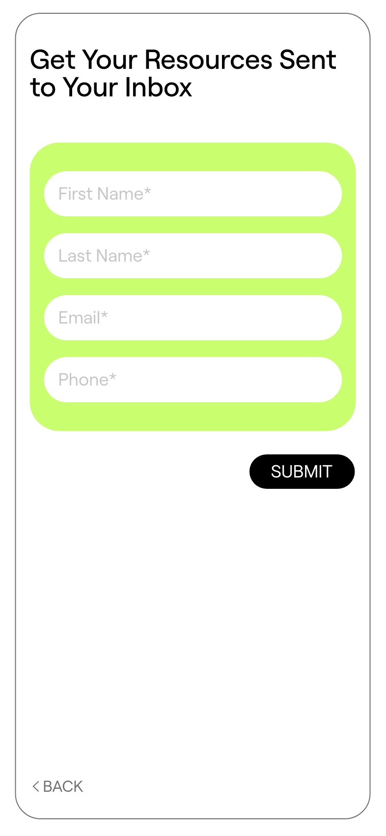
The landing page was built for students rather than colleges: a tool Motimatic could put in front of the students at any school it worked with. A short quiz — where are you in your studies, what’s getting in the way — that ends with the resources that fit, and an offer to email them.

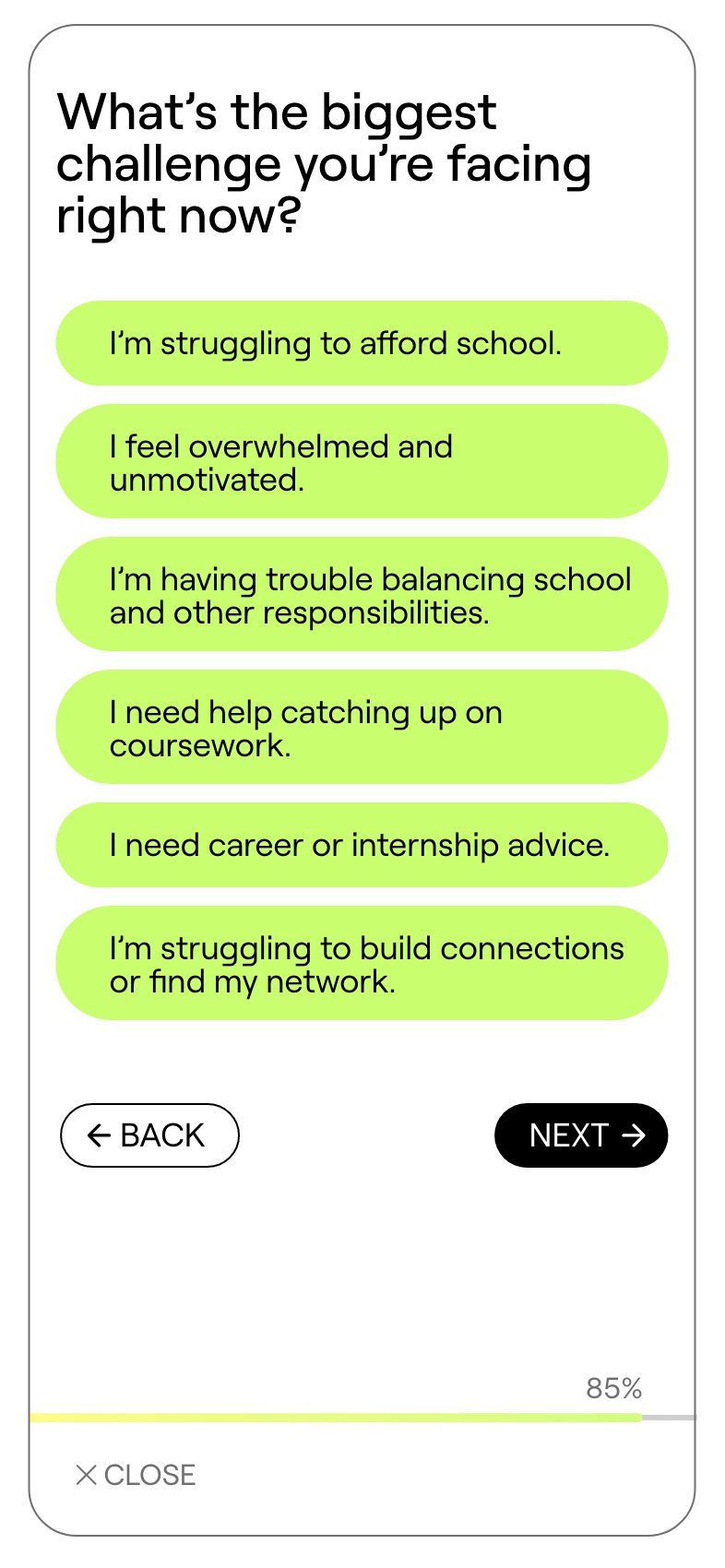
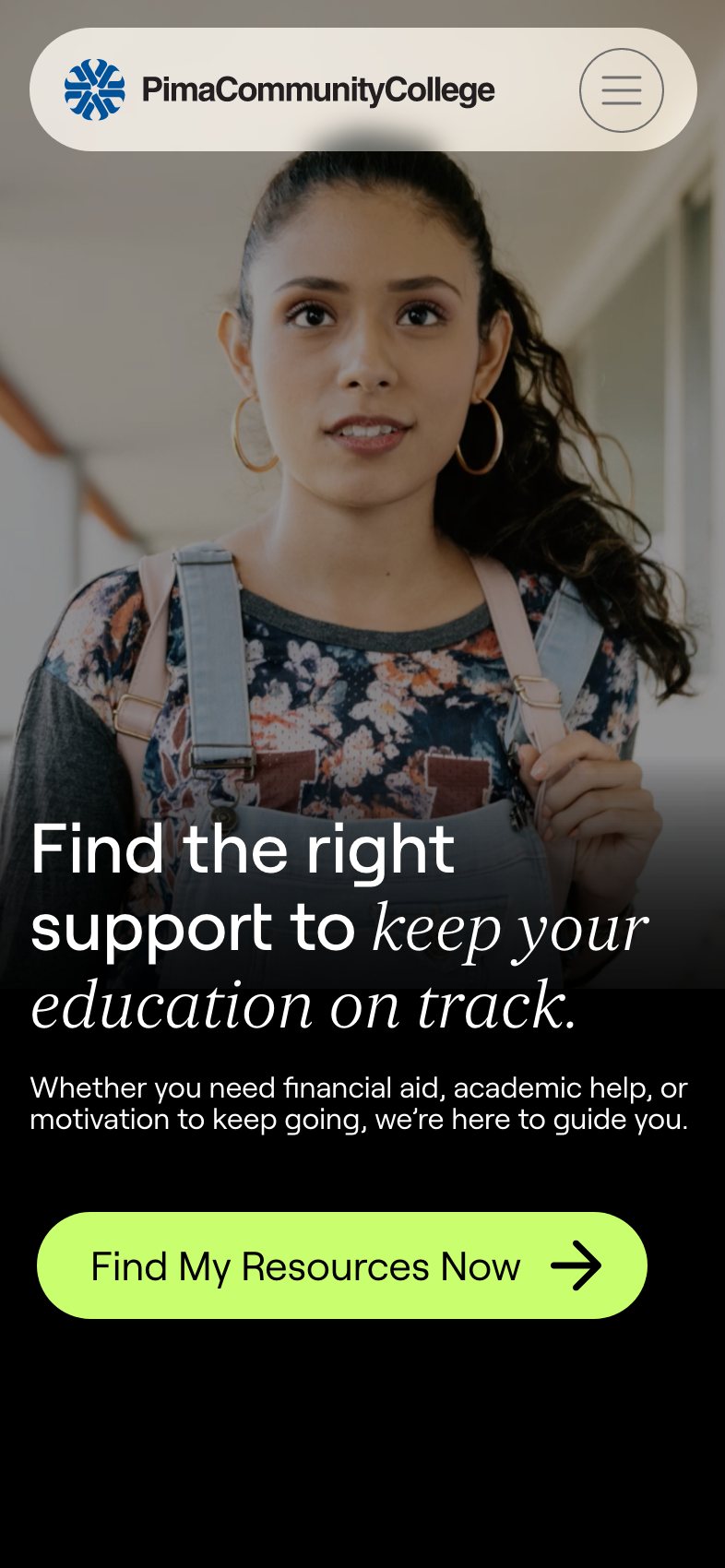
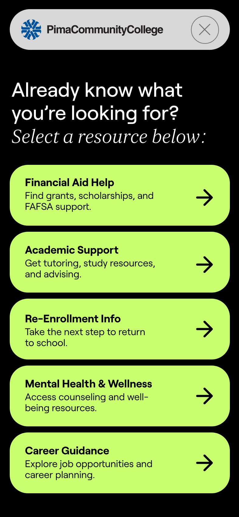
It had to hold the attention of an audience raised on the best apps on their phones, so it behaves like one: one question to a screen, big tap targets, a progress bar that’s at 85% by the second question, and nothing on any screen that doesn’t lead to the next. It was built to take on any college’s brand: here it’s in Motimatic’s own, and beside it, dressed for a pitch to Pima Community College. I designed it from Motimatic’s wireframes and content, phone first, then desktop.

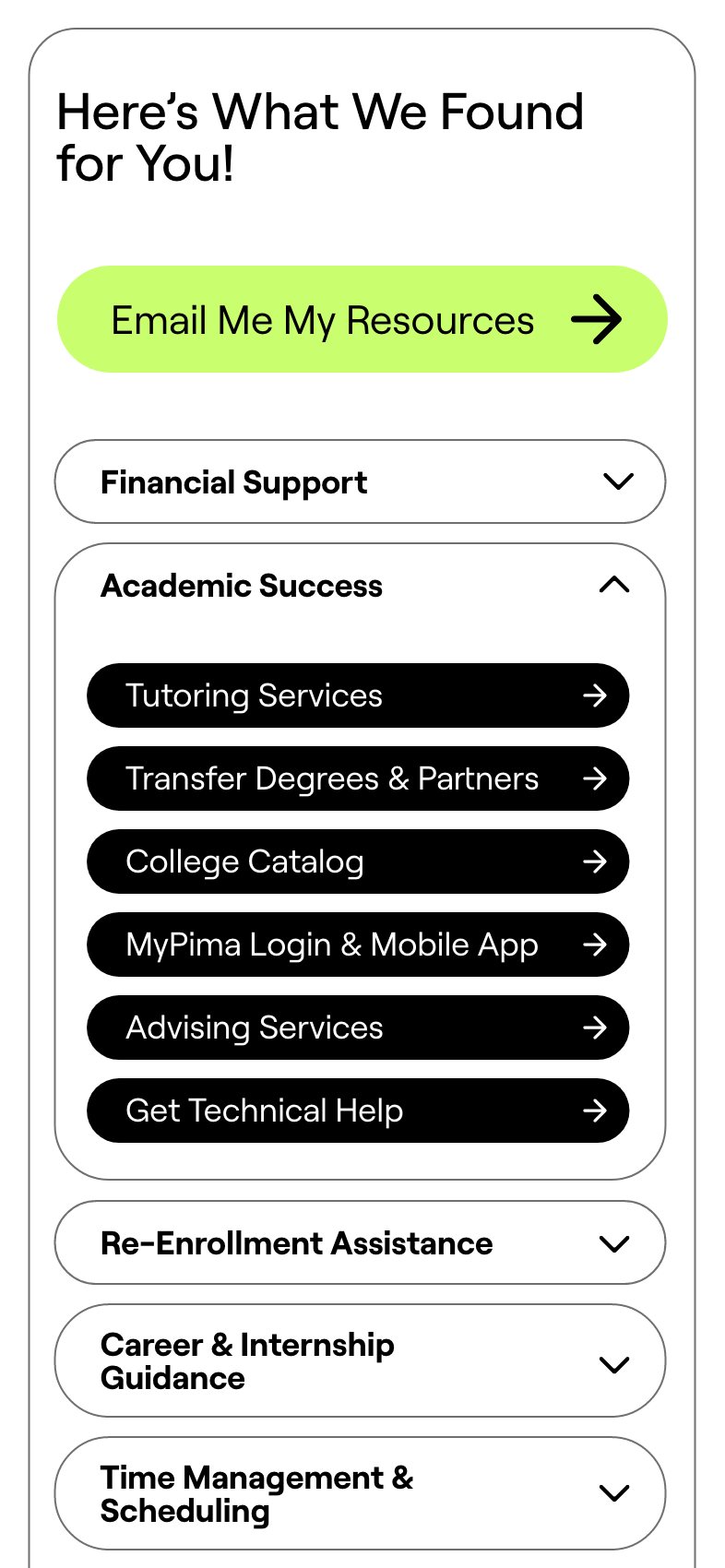
Home, in Motimatic’s own brand: the resource cards, then the first question further down the page An answer picked: I’m currently enrolled and need support to stay on track Question 2: what’s the biggest challenge you’re facing right now? An answer picked: I need help catching up on coursework Here’s what we found for you: the matched resources A resource opened to its links Get your resources sent to your inbox: the form
The Pima Community College version: find the right support to keep your education on track The Pima Community College version, menu open: already know what you’re looking for? Select a resource below
The landing pageHome, scrolling down to the first question, an answer picked, then the second question, the matched resources and the form. Click the phone to go ahead. Beside it, the same tool dressed for a pitch to Pima Community College.

One system, four places

It ran as separate projects across 2024 and 2025, as a freelancer working with Motimatic’s team: the guidelines and the deck first, then the website and the landing page, each built on the guide that came before it. A brand has to work in a pitch deck, on a homepage and on a student’s phone. This one does.

Next

ICBA — three conventions, three identities, and the year it all went online.

Read the case study →