Nicola Goodwin

Work — Identity

Identities with a system behind them.

Built from nothing6 brands
Rebuilt3 brands
ScopeLogo, system, guidelines
Applied toPrint, web, social, merch

A logo is the smallest part of an identity. The rest is the system around it: the color, type, imagery and voice that keep a brand recognizably itself on a business card, a pitch deck and a homepage, whoever happens to be making them.

Built from nothing

6 brands

New companies, and a brand built from the name outward: the mark, the system around it, and the first things it had to work on.

OneThread

Founding creative direction · 2025–now

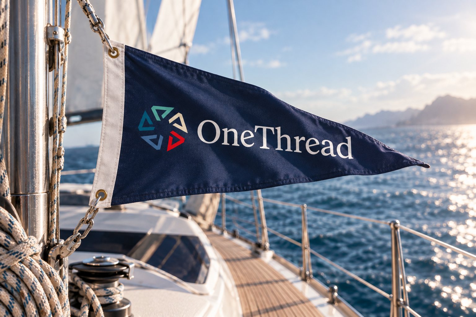
A heritage travel program for young adults, and the first brand I built for it from the name outward. The mark is five sailing burgees closing into a circle, and every country the program reaches flies its own, starting with Birthright Ireland.


Case study →

The OneThread logo, reversed out of navy
A navy OneThread burgee flying from the rigging of a yacht
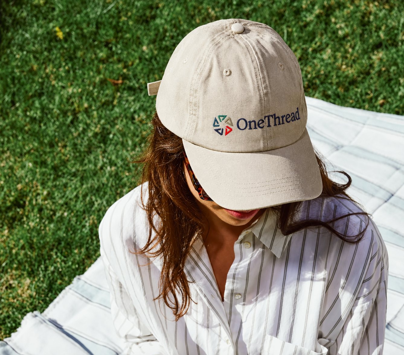
A stone-coloured cap embroidered with the OneThread mark

KLIK

Founding creative director · 2021–2022

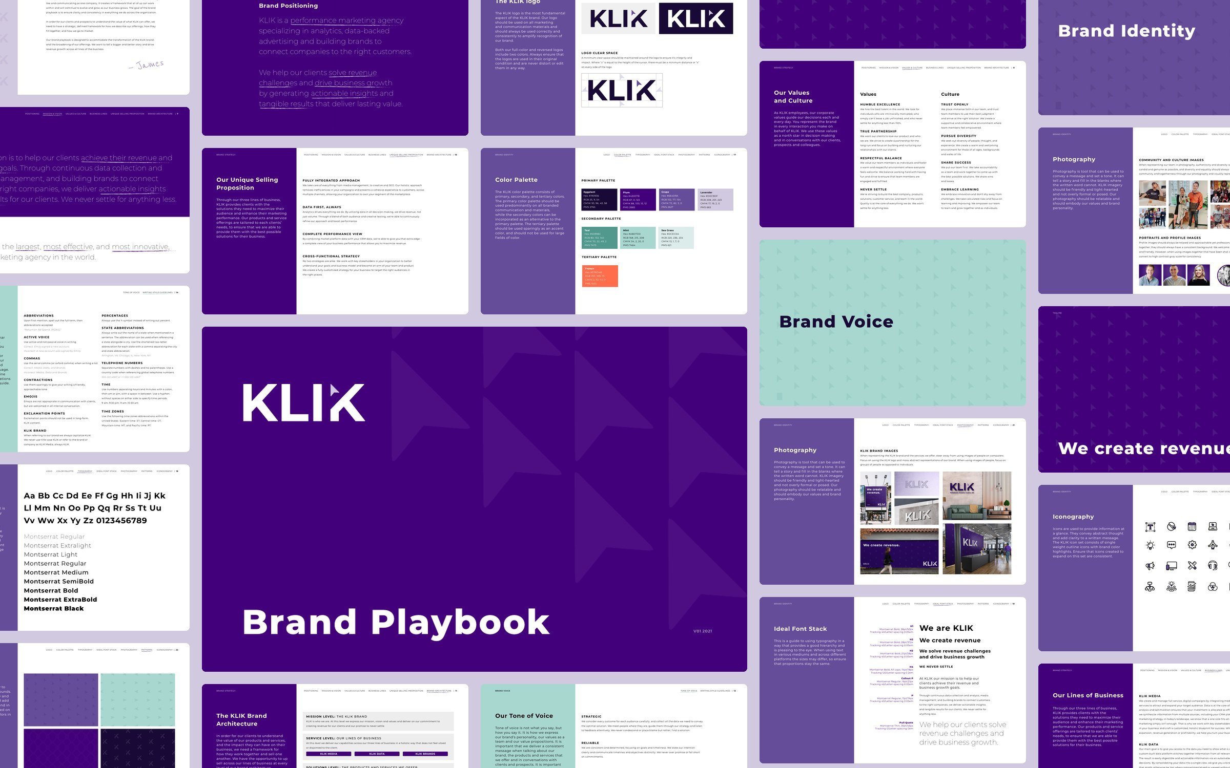
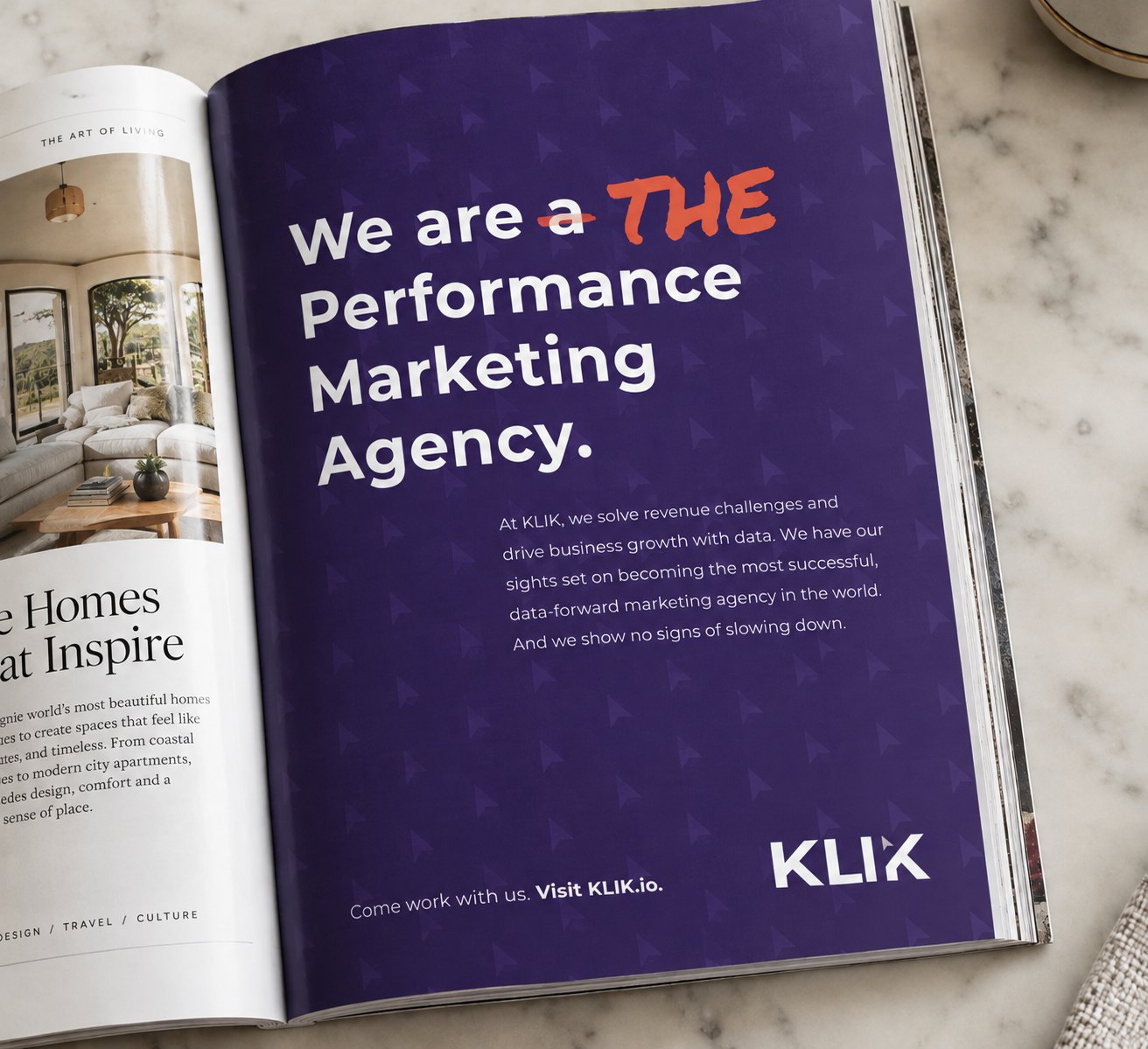
A performance marketing agency that talked in numbers. A cursor clicks into the last K of the wordmark, and a playbook grows from one line, We create revenue, into the voice, the website and everything the agency put its name to.

Case study →

The KLIK logo in white on its purple, over the cursor pattern
Pages from the KLIK brand playbook laid out together around its cover
The KLIK print ad open in a magazine

inSpring

Brand, website & decks · 2022–2024

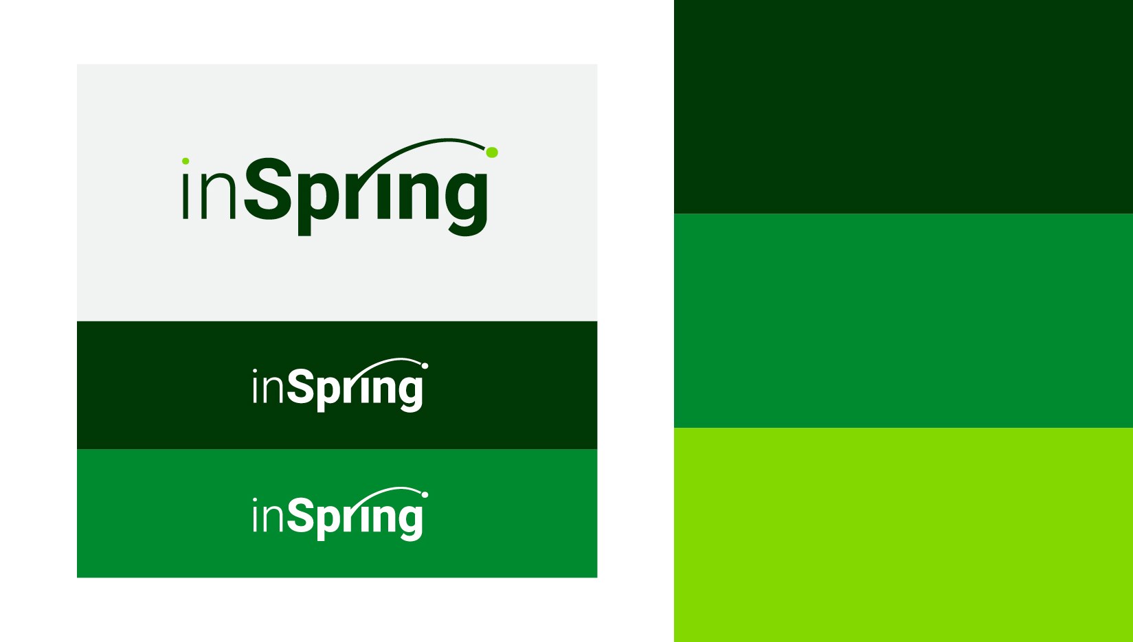
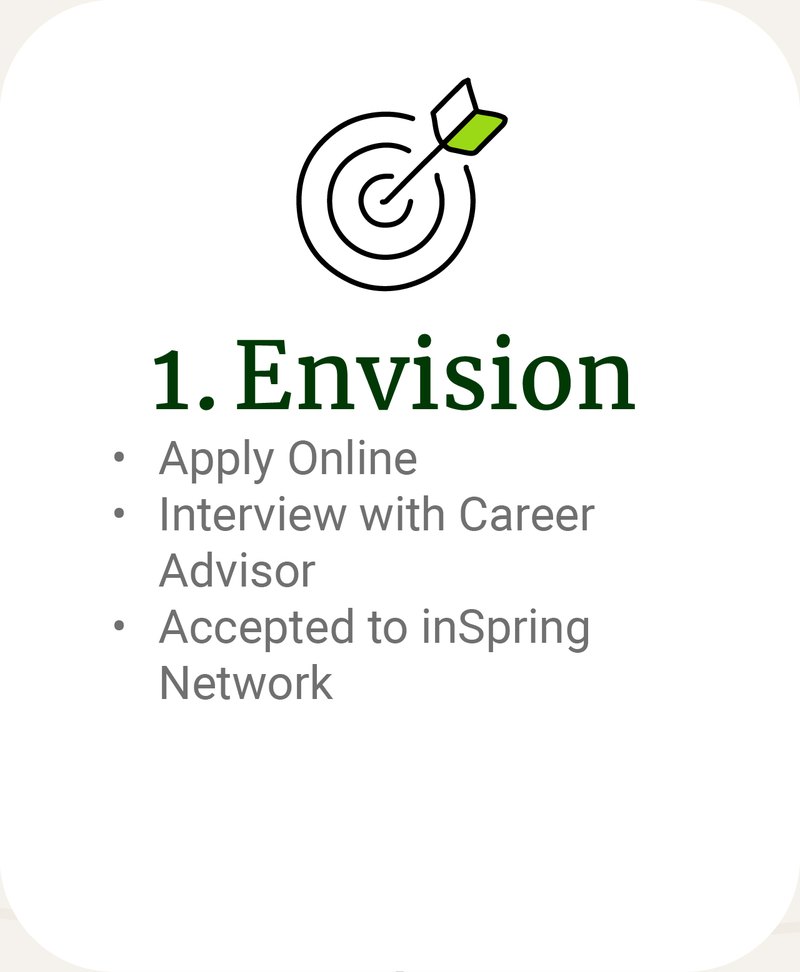
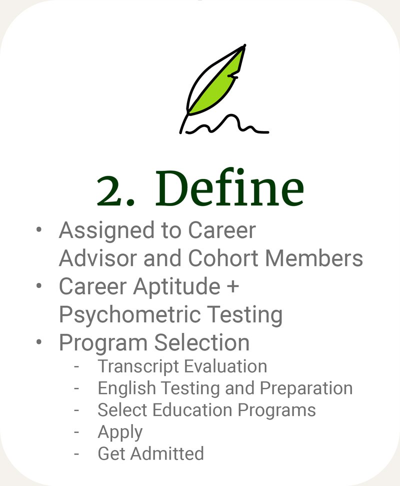
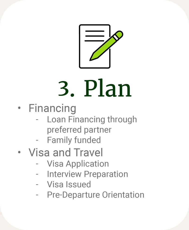
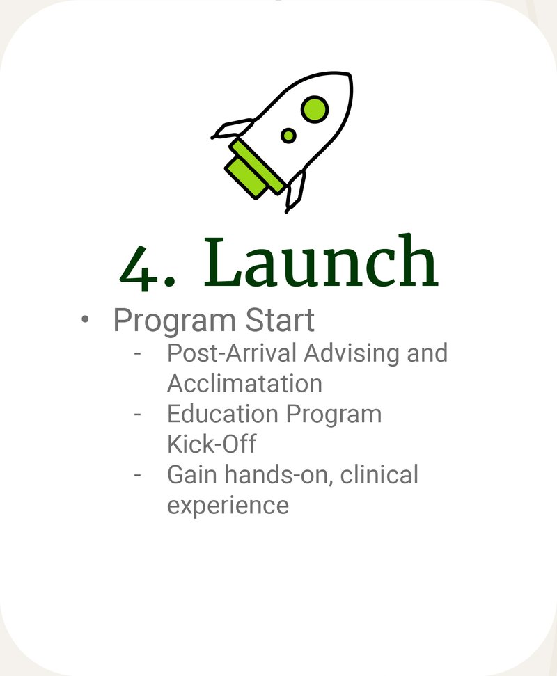
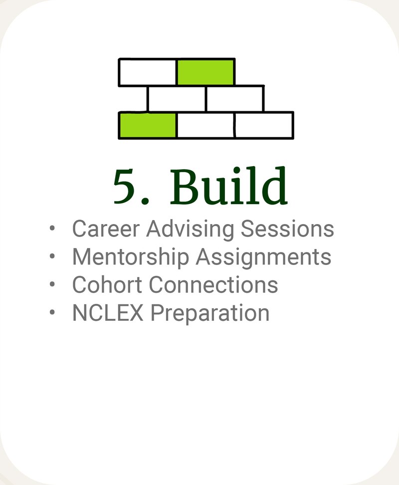
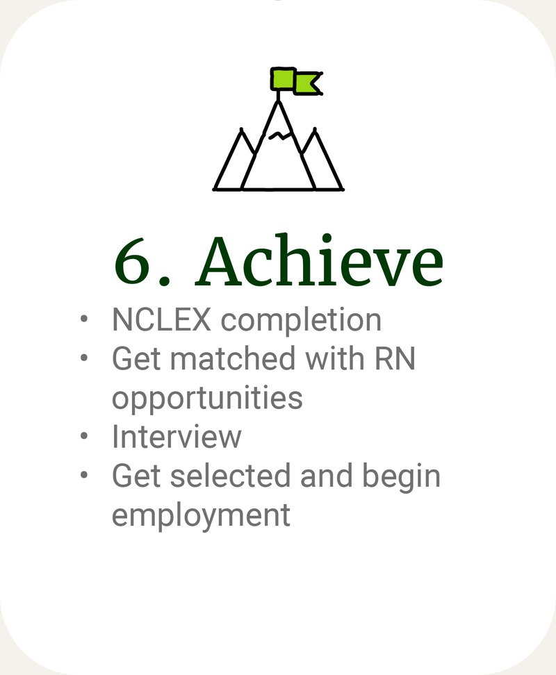
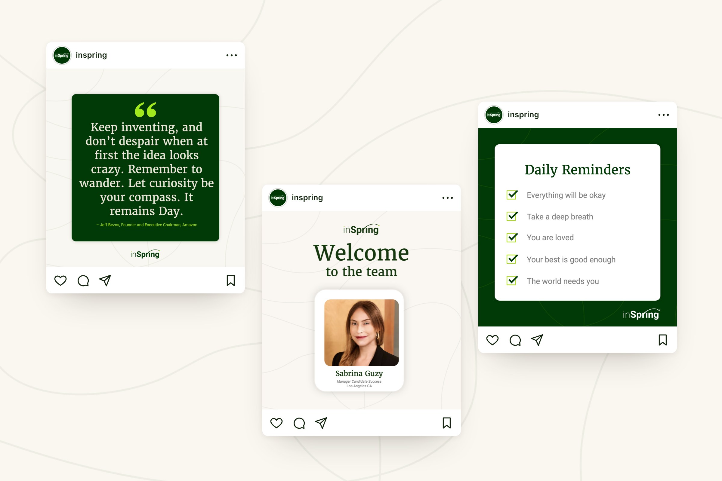
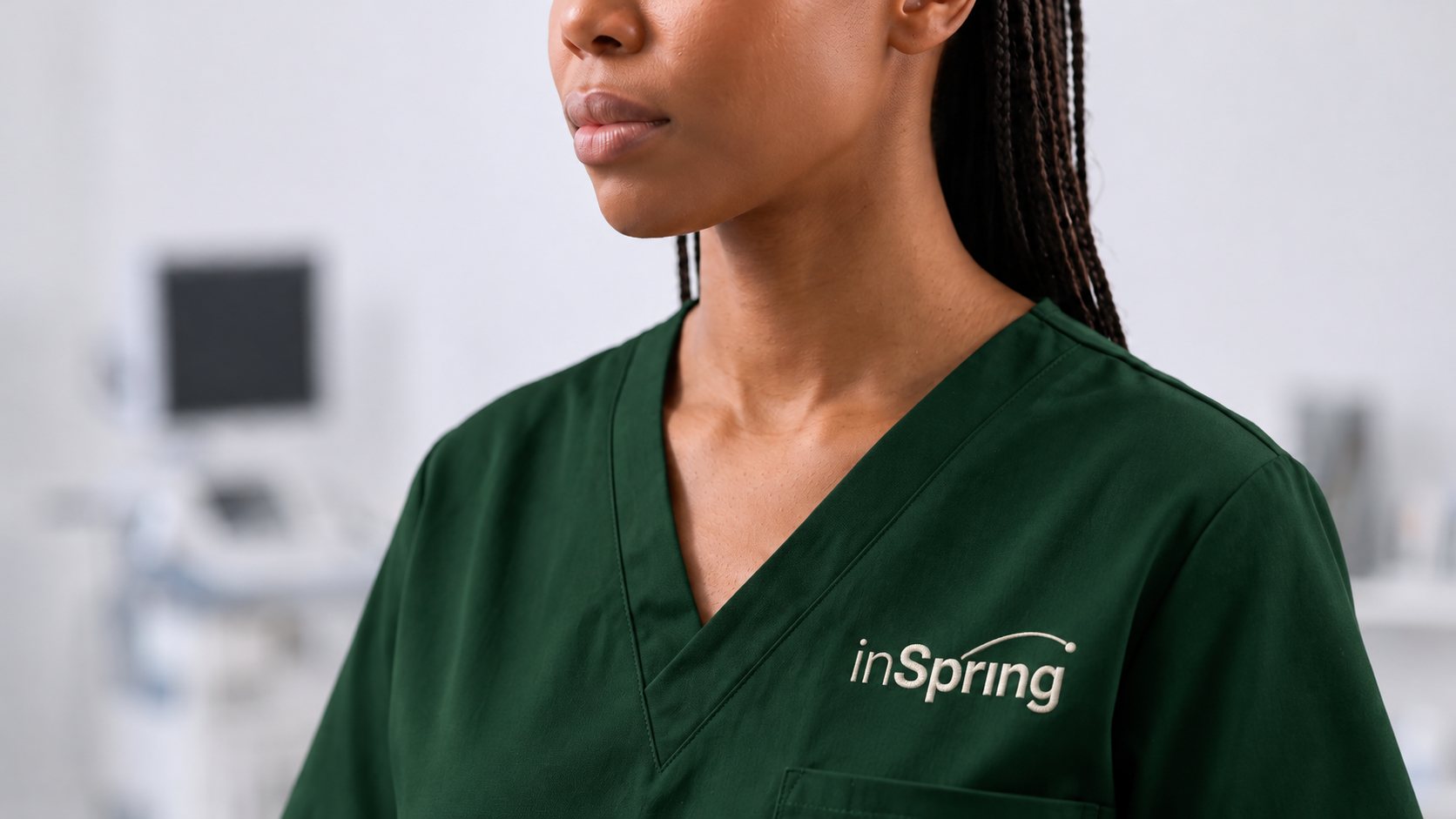
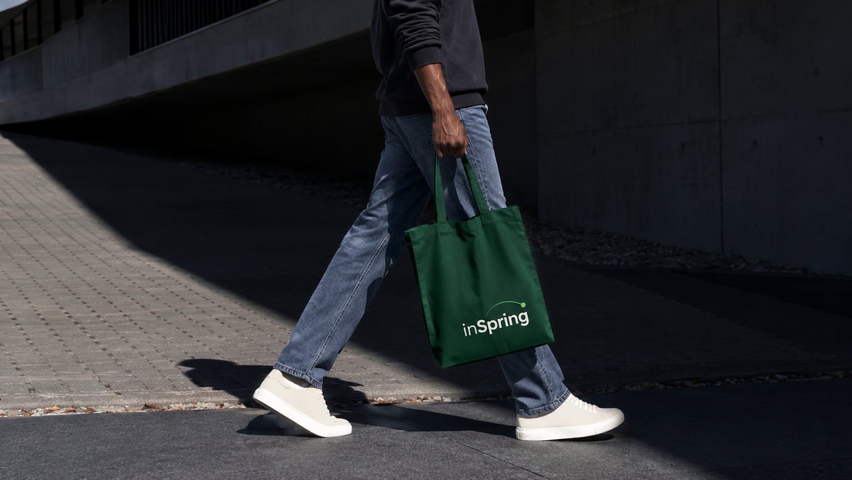
A marketplace that brings international talent to the US for careers in healthcare and tech, and a brand I built from scratch: a wordmark with a spring in its step, deep green and lime on a warm cream, the website and every deck template, and a system that carries from a seven-step candidate journey to social, scrubs and a tote.

The pitch deck →   The website →

The inSpring wordmark on light grey, dark green and green, beside its palette of dark green, green and lime
Three inSpring social posts: a quote, a welcome to a new team member and a list of daily reminders
Green scrubs embroidered with the inSpring wordmark
A green inSpring tote bag, carried down a sunlit street

Dr Ross Feller

Brand identity · 2024

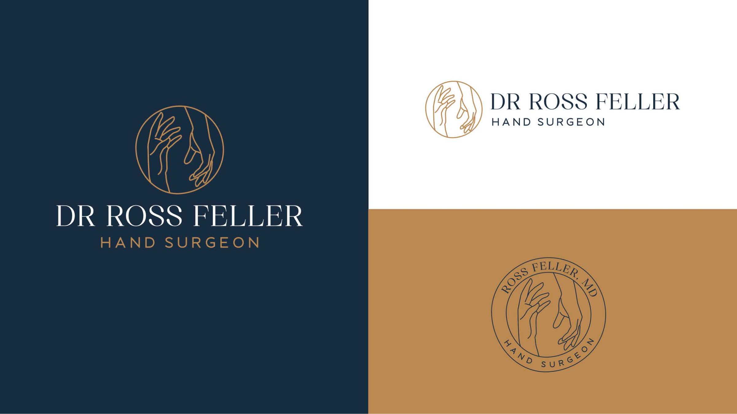
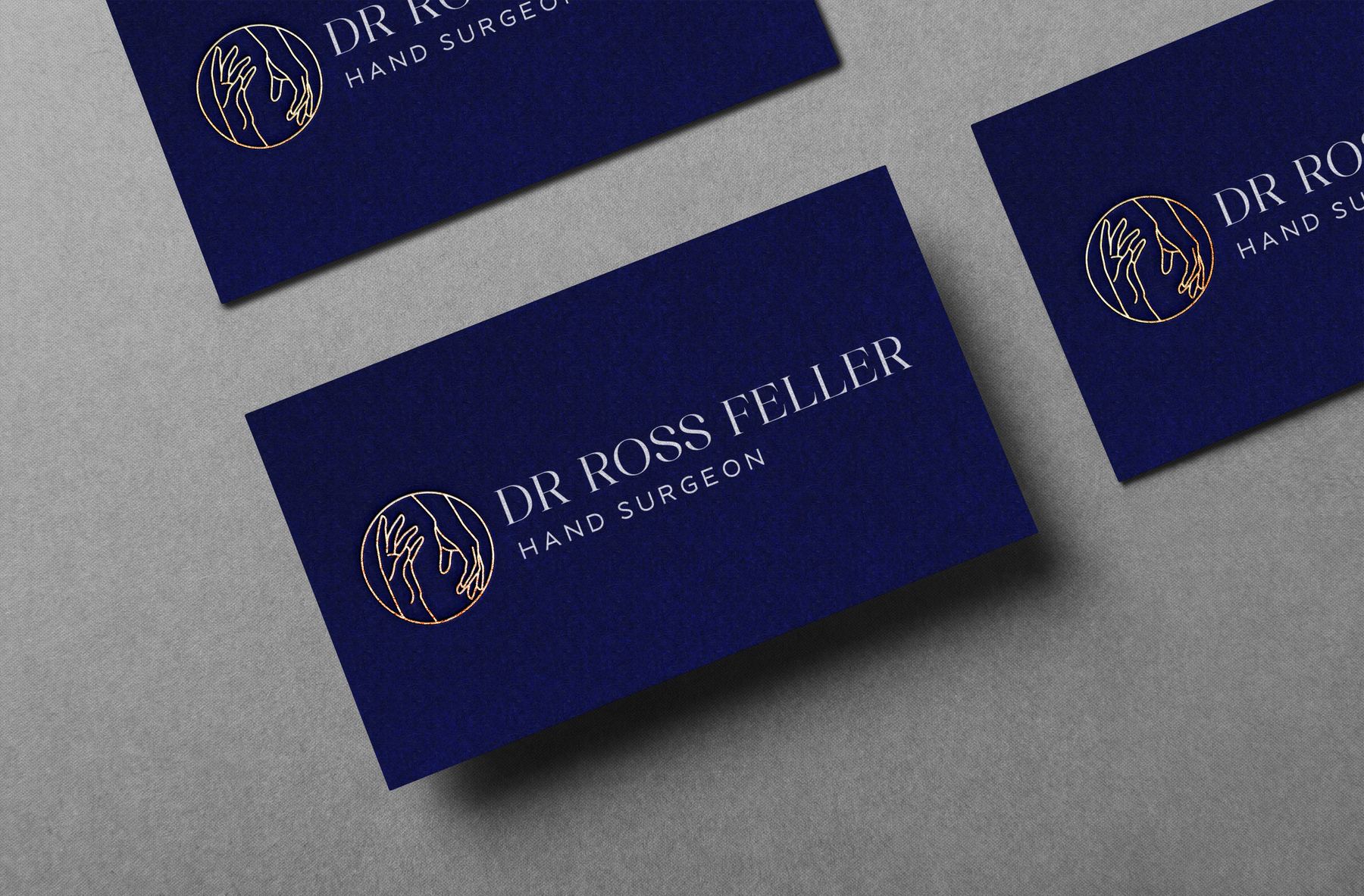
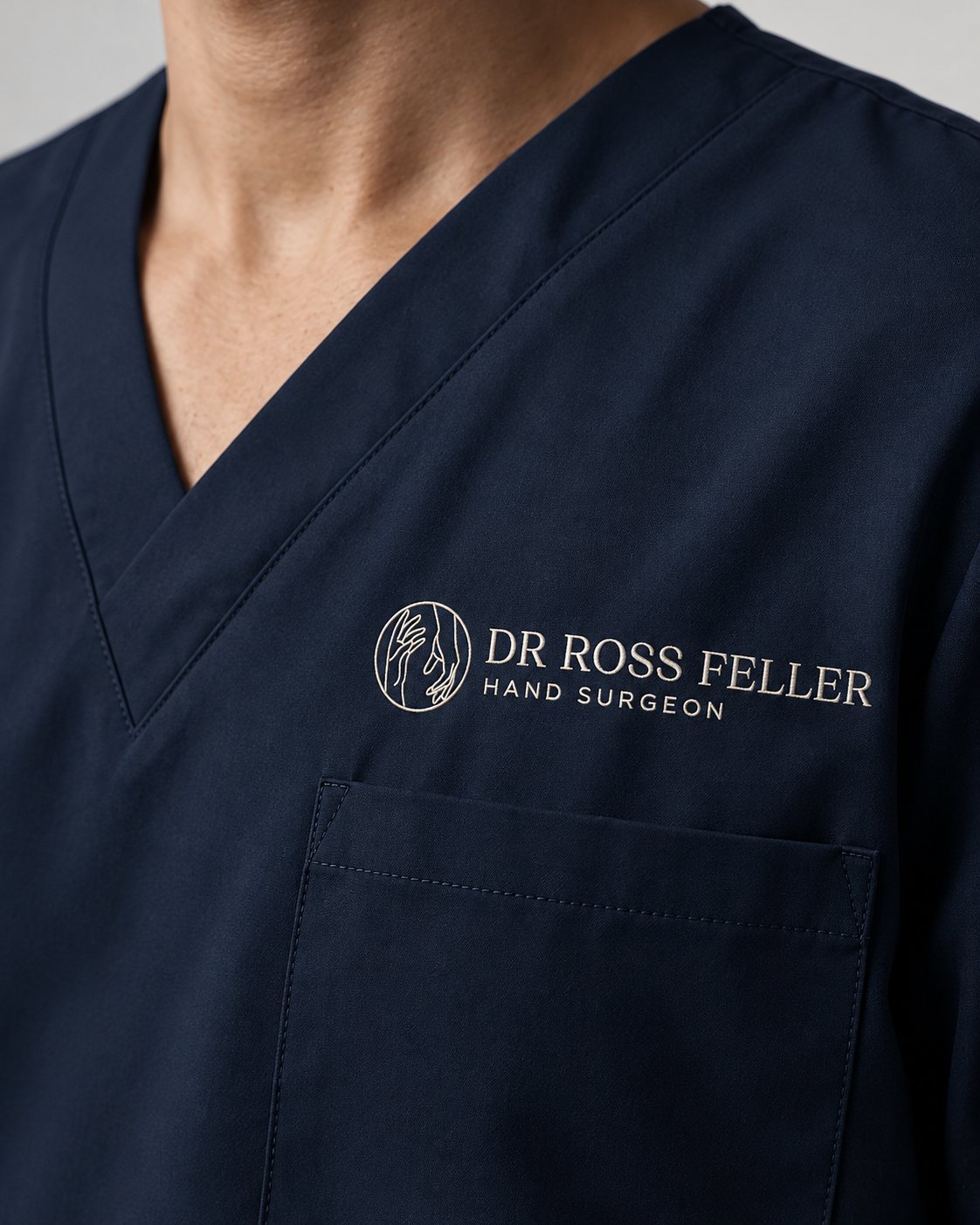
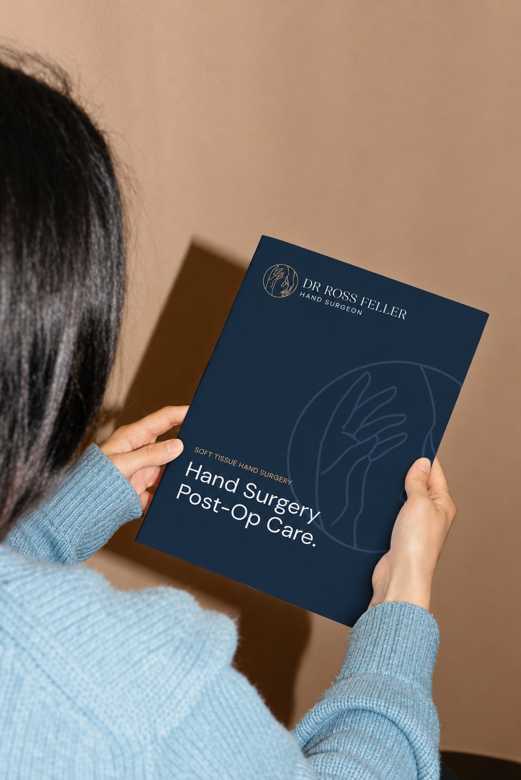
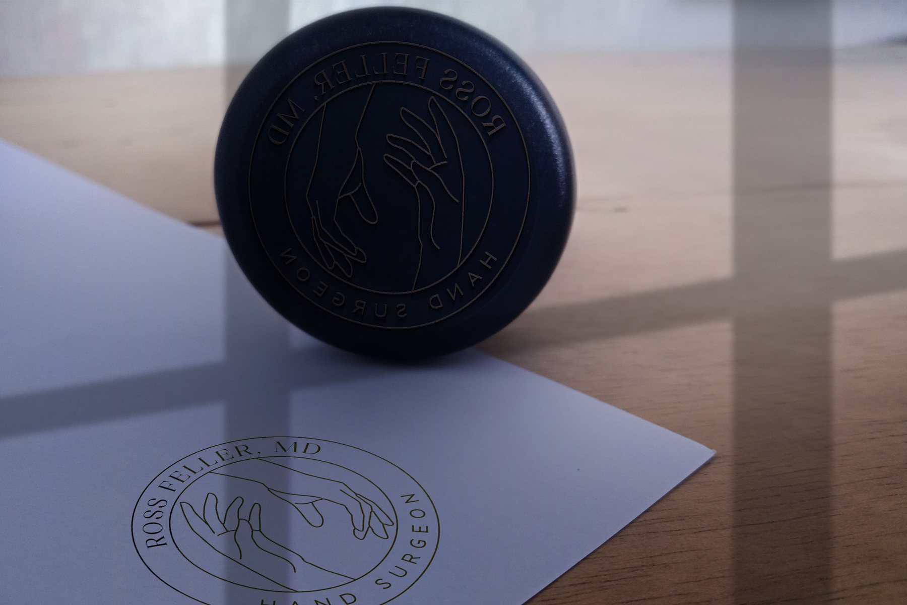
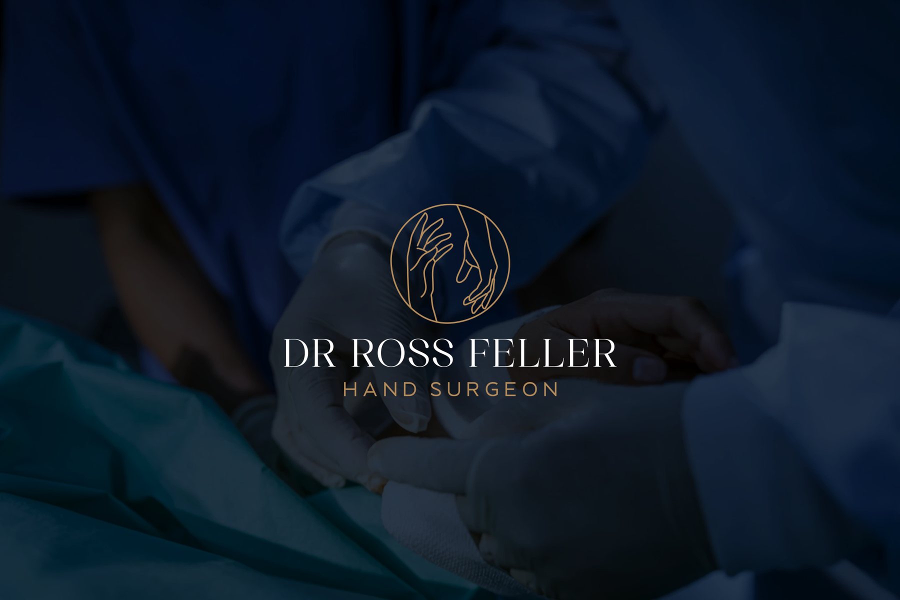
A hand surgeon’s private practice. Two hands drawn in a single line inside a circle, in navy and copper, with a serif wordmark that reads as quietly established, carried onto business cards, a post-op care guide, embroidered scrubs and a stamp.

The Dr Ross Feller logo three ways: on navy, on white, and as a round seal on copper
Navy Dr Ross Feller business cards on grey stone
Navy scrubs embroidered with the Dr Ross Feller logo
A patient holding the Hand Surgery Post-Op Care guide
A stamp of the round Ross Feller, MD seal, pressed onto paper
The Dr Ross Feller logo over a dark photograph of surgeons at work

Coding Bootcamps

A brand KLIK owned · 2021–2022

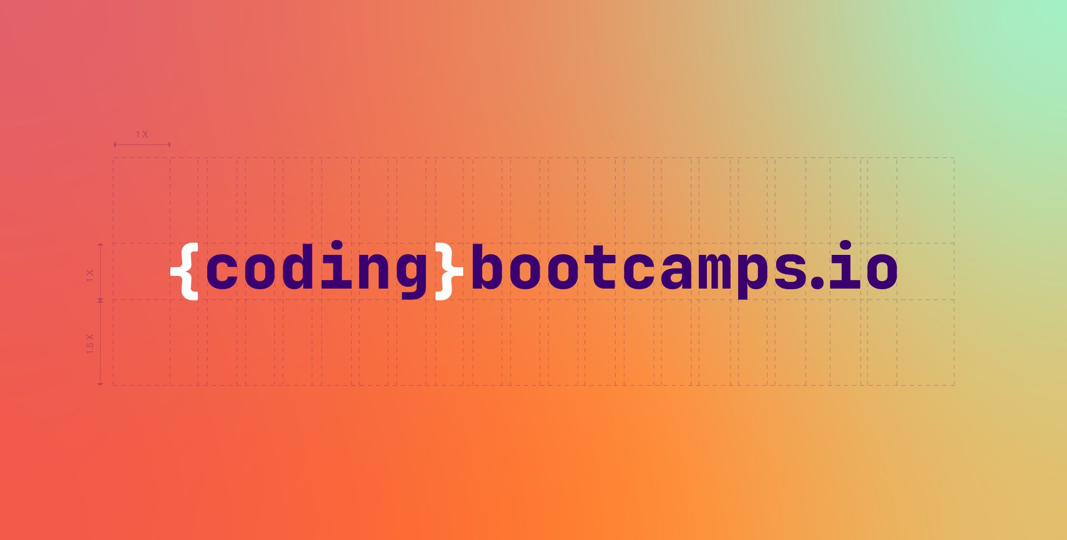
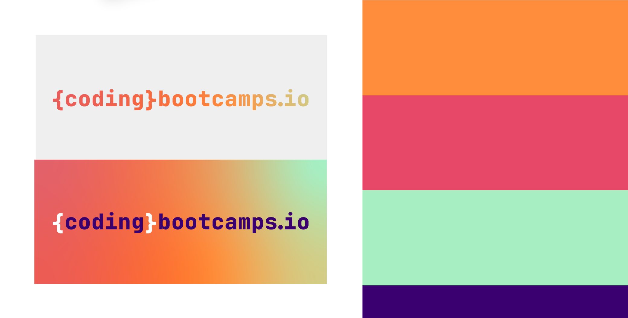
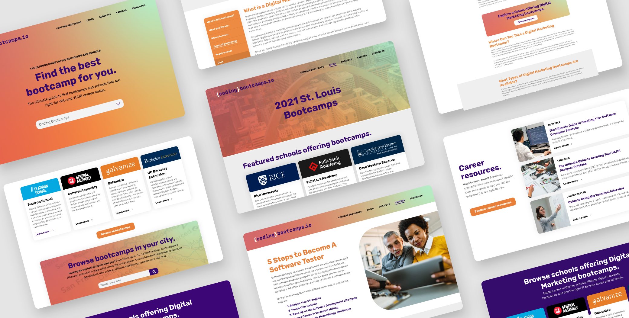
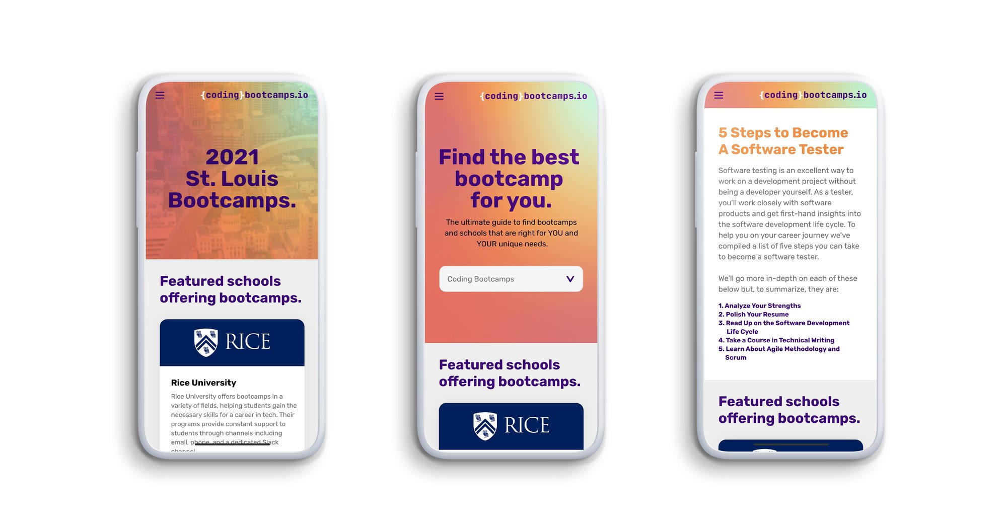
KLIK’s guide to finding the right coding bootcamp. Bootcamps were everywhere at the time, so the brand had to stand out among the schools it listed and still read as code at a glance: a wordmark in curly brackets, on a warm gradient.

In the KLIK case study →   The website →

The Coding Bootcamps wordmark, in curly brackets, on its gradient
The Coding Bootcamps wordmark on white and on the gradient, beside its palette
Pages from the Coding Bootcamps website, laid out together
Three Coding Bootcamps pages on phones

Money Side Up

A brand KLIK owned · 2021–2022

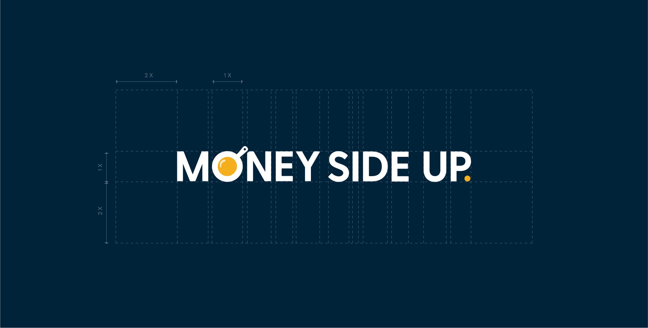
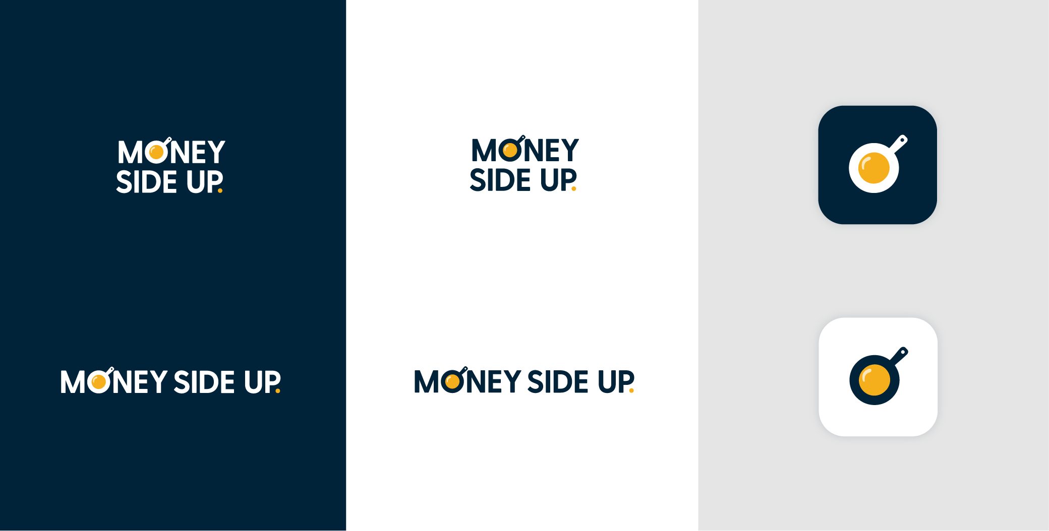
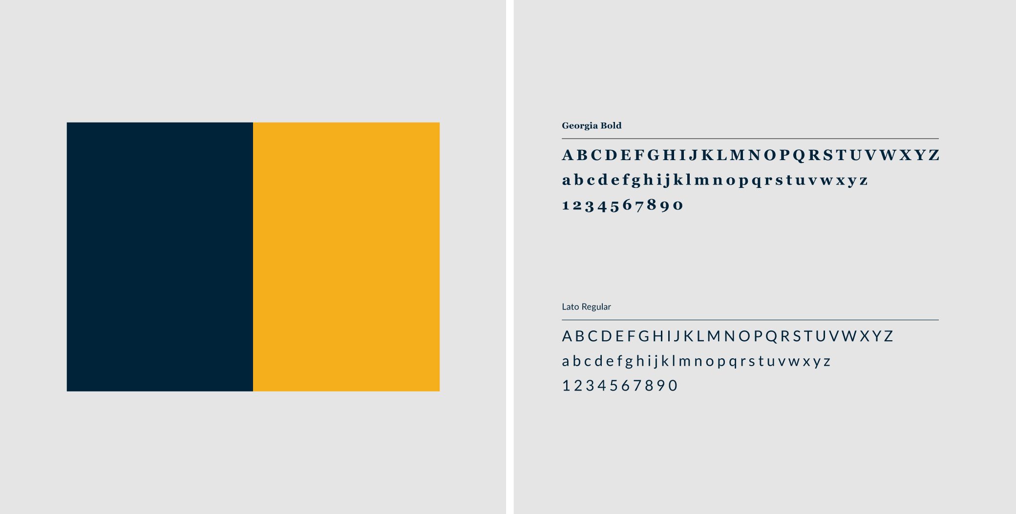
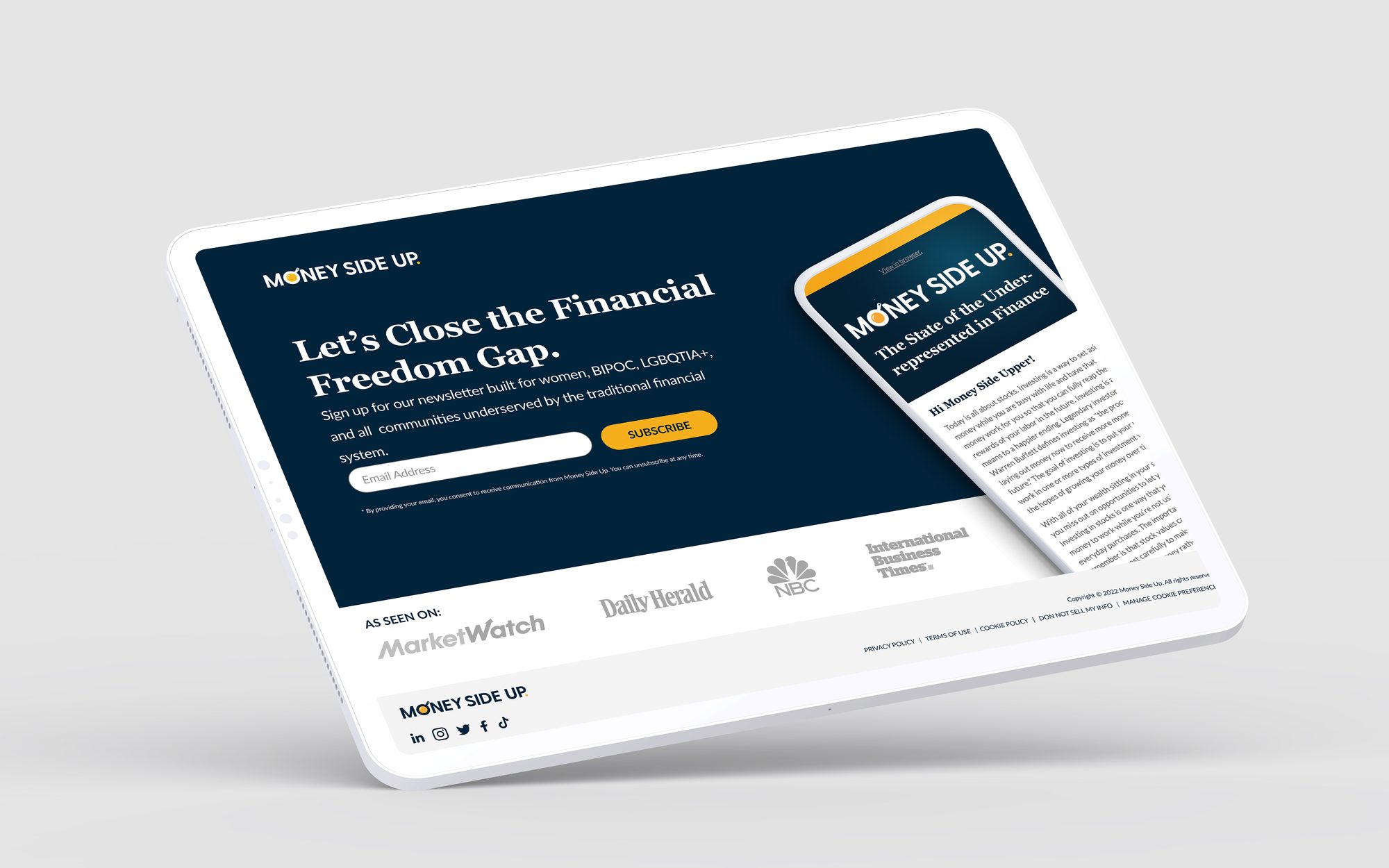
A personal finance newsletter for women, BIPOC and LGBTQIA+ readers, communities that traditional finance has underserved. The brand had to feel friendly and welcoming and still be trusted on a subject like money: navy and gold, a confident serif, and a gold O at the heart of the wordmark.
In the KLIK case study →   The website →

The Money Side Up wordmark on navy, over its construction grid
The Money Side Up logo on navy, white and grey, with its stacked version and the gold O as an icon
The Money Side Up palette of navy and gold, and its typefaces
The Money Side Up home page on a tablet

Rebuilt

3 brands

Established companies that kept their logo and needed a brand that could keep up with them. The mark stayed; the system around it is new.

City Light Capital

Creative direction & design · 2021–2025

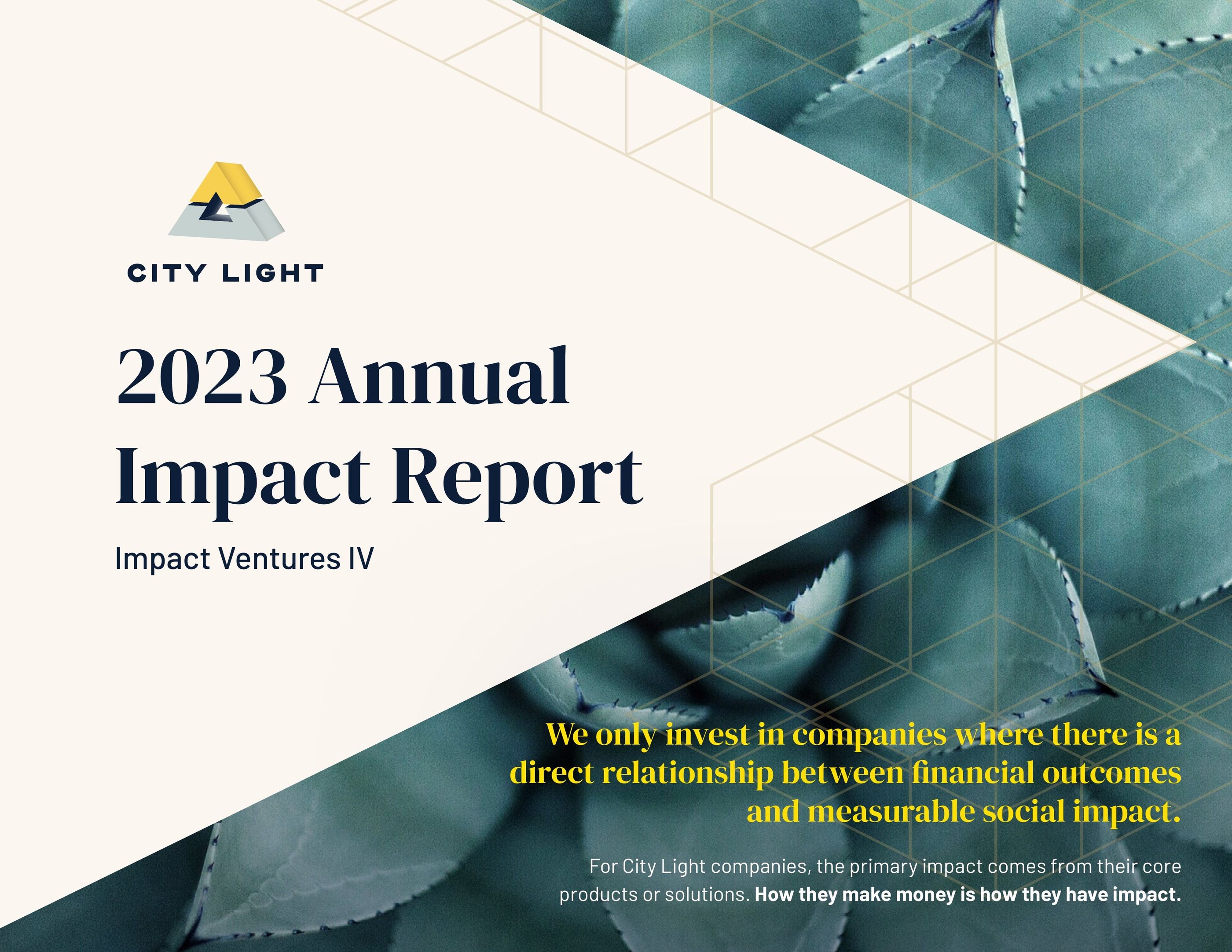
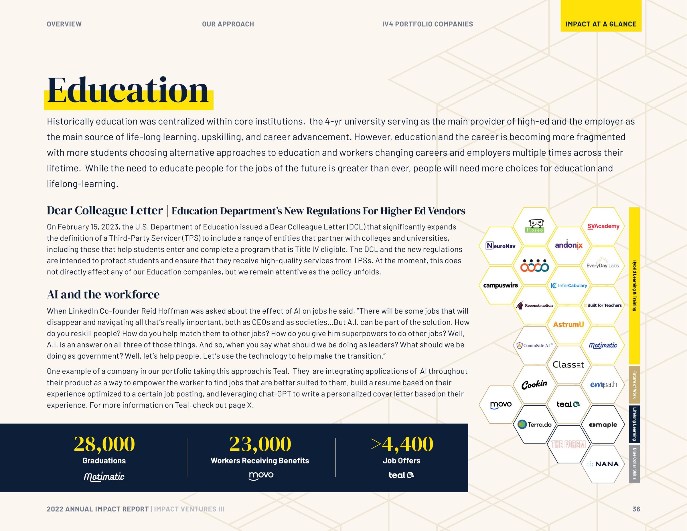
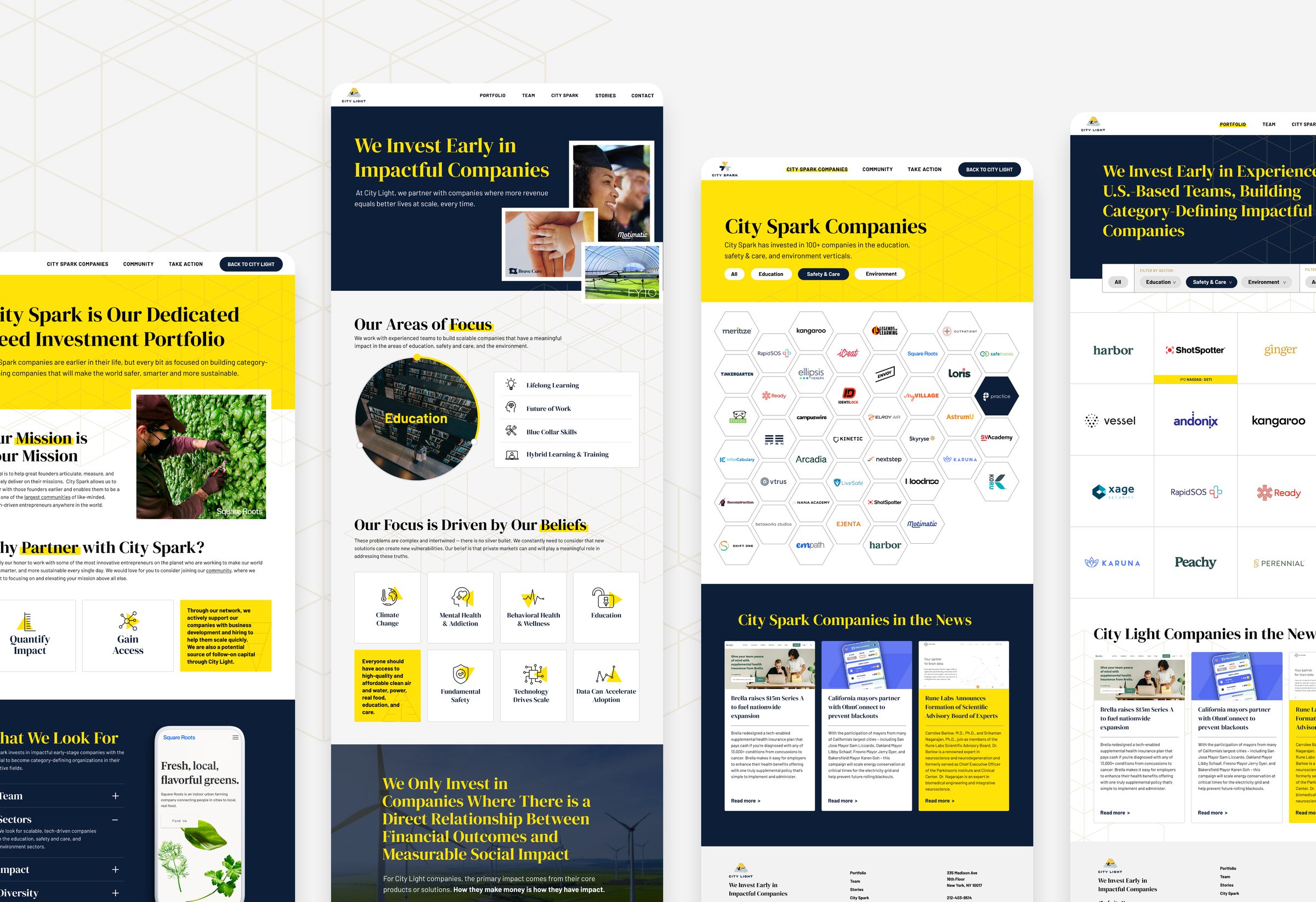
An impact fund that kept its logo and needed a brand with the authority its track record had earned. Around the mark I built a flat system of navy, yellow, hexagons and linework, and carried it through four years of impact reports, decks and the website.

Case study →

The cover of the City Light 2023 Annual Impact Report
A report spread: education companies in the hexagon grid, with the numbers beneath
Pages from the City Light and City Spark websites

Motimatic

Brand direction & design · 2024–2025

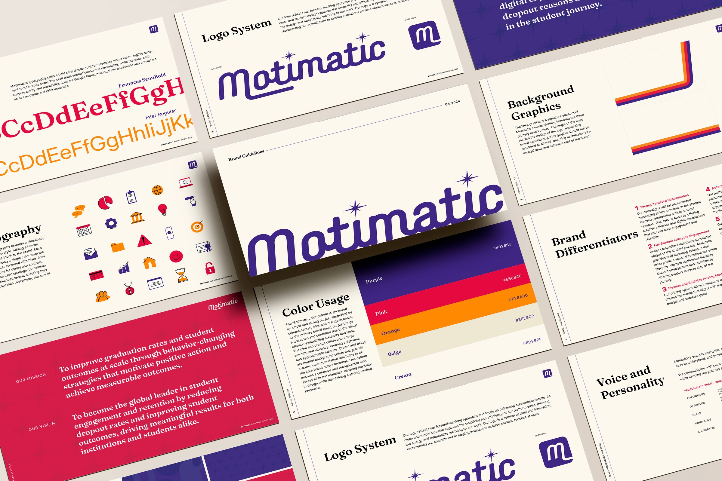
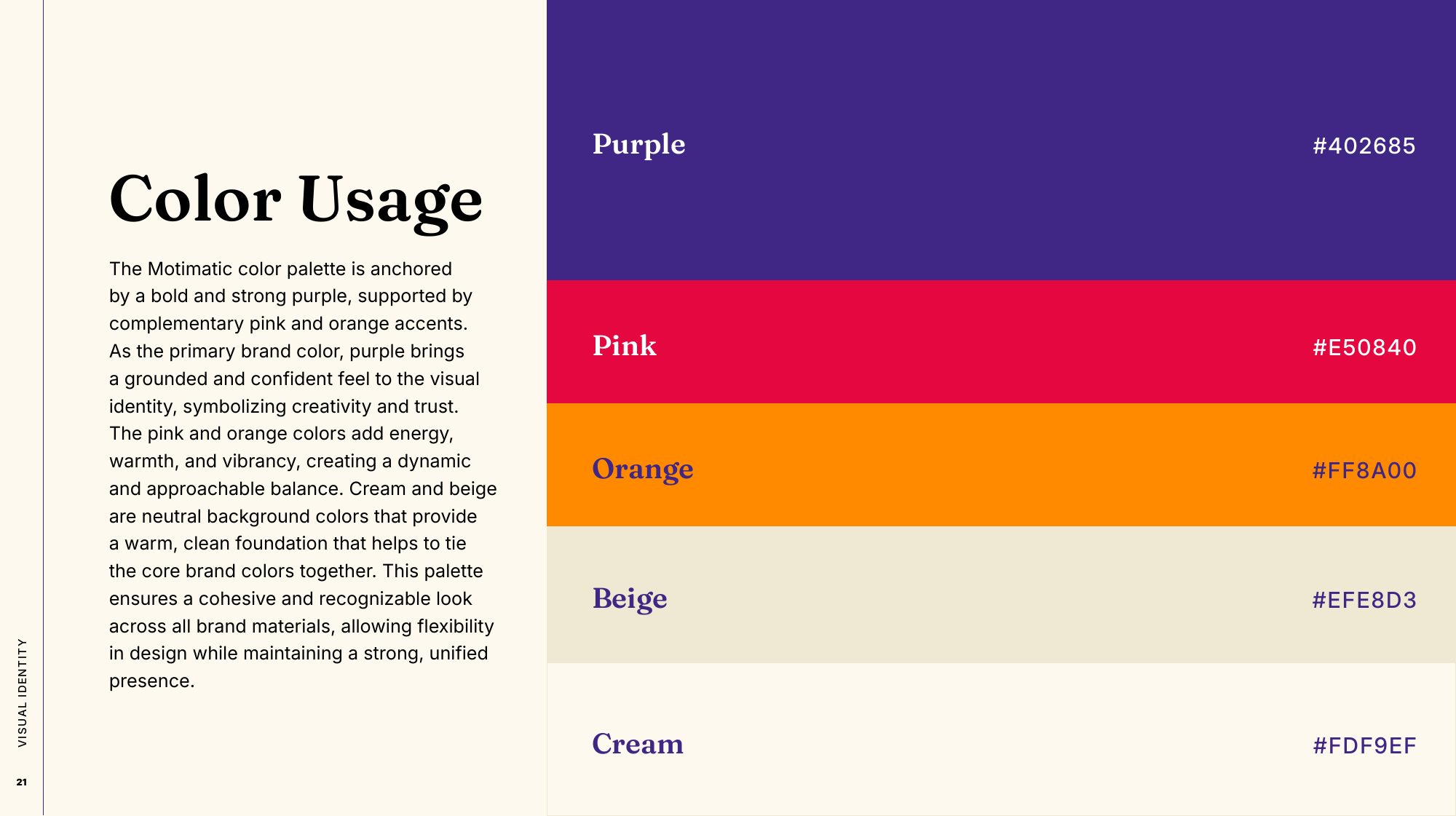
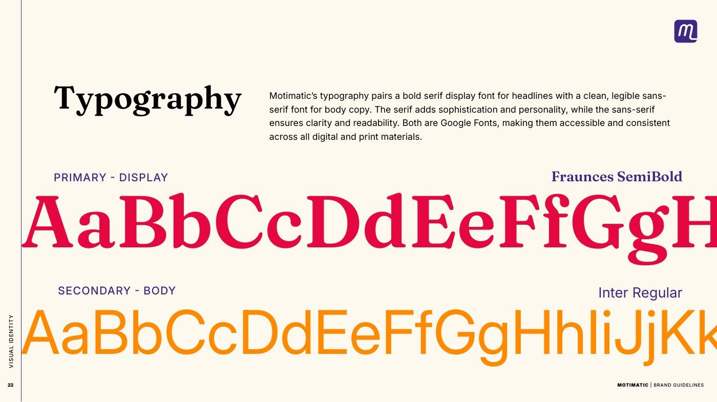
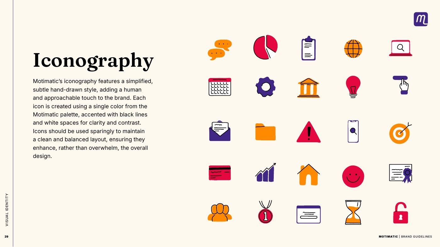
An edtech company that had grown from ad campaigns into a platform. The wordmark stayed and everything around it is new: a palette anchored in deep purple, patterns drawn from the logo, a hand-drawn icon set, and guidelines that spend half their pages on language.

Case study →

Spreads from the Motimatic brand guidelines
The Motimatic color palette
Motimatic typography
The Motimatic icon set

Pathstream

Brand guidelines & application

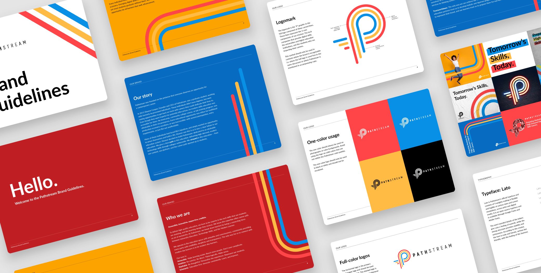
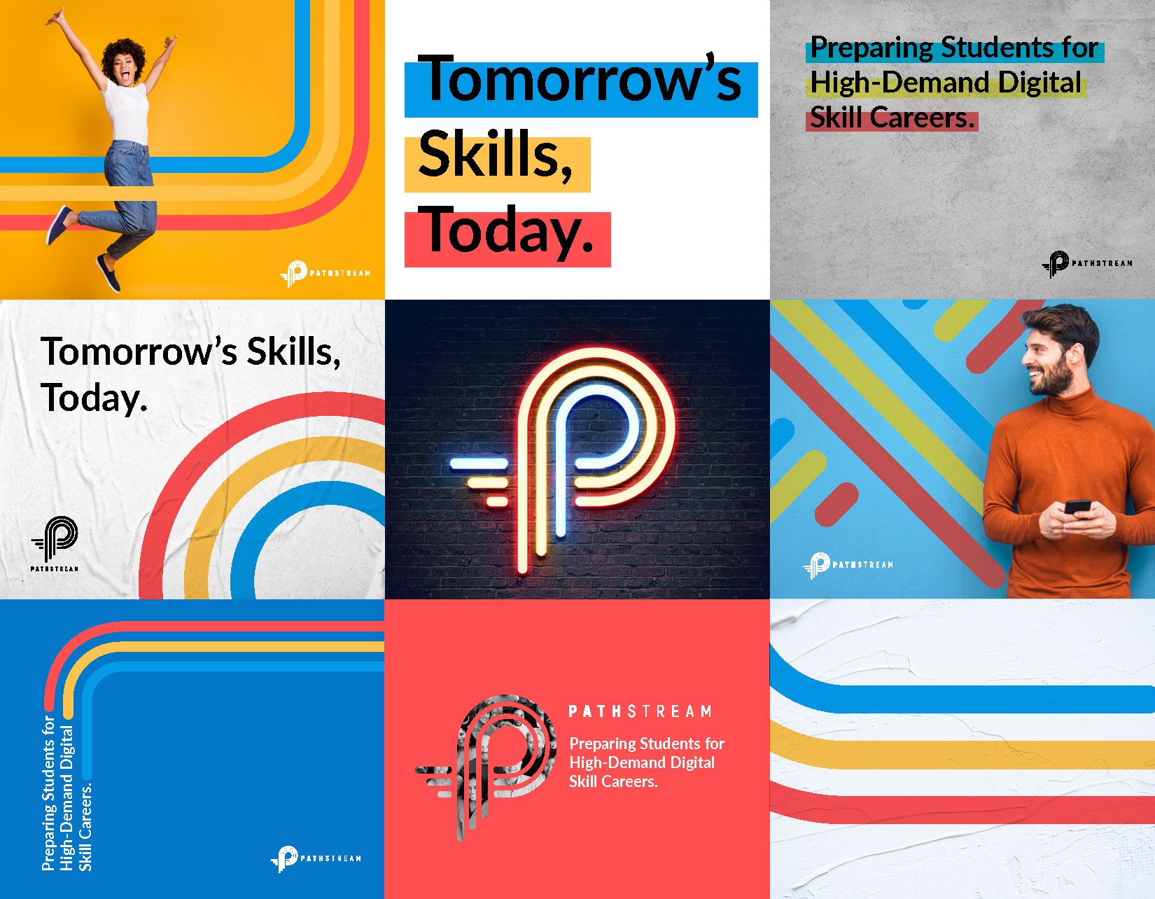
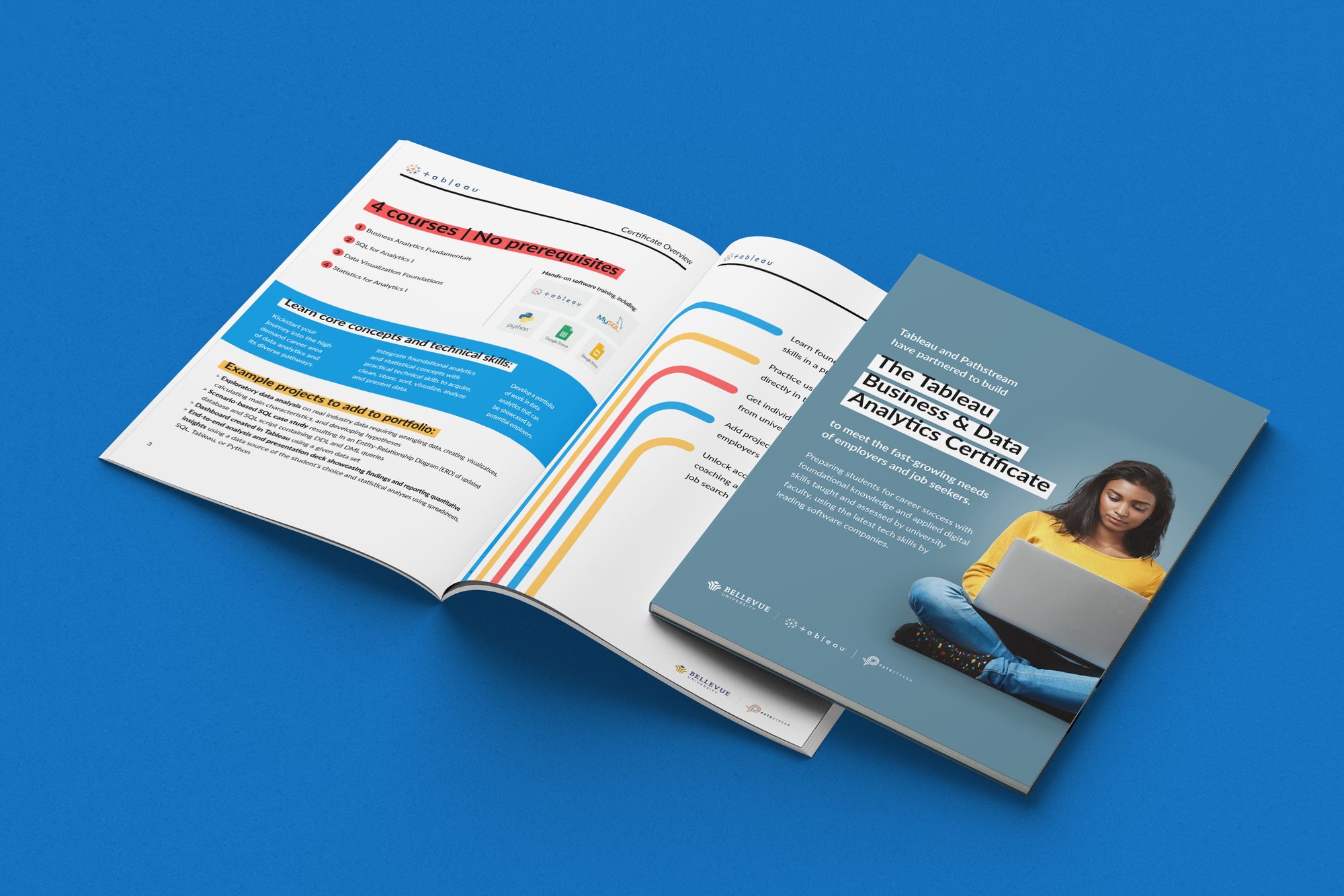
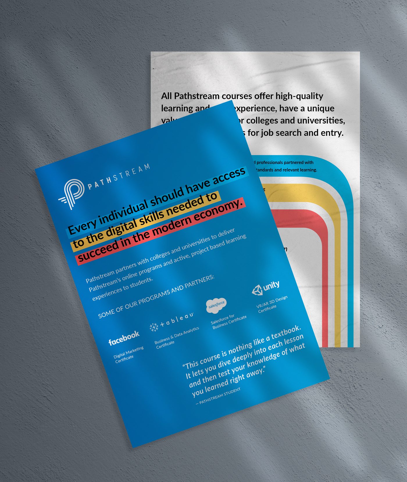
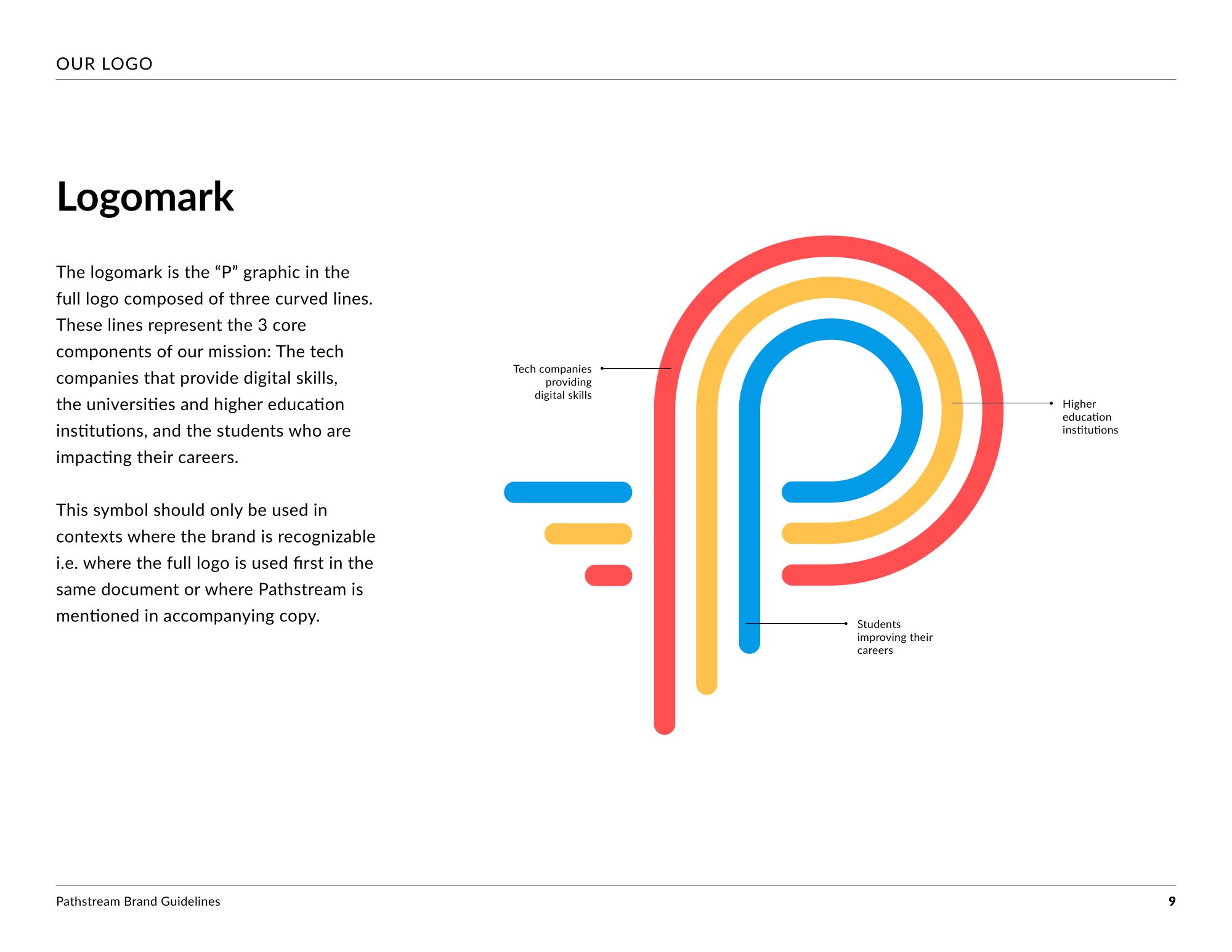
An edtech company preparing students for high-demand digital careers, alongside the universities and the tech companies that hire them. The brand was rebuilt around its P, three curved lines in red, yellow and blue for the three groups its mission brings together, and carried into guidelines, brochures, flyers and the website.

The website →

Pages from the Pathstream brand guidelines, laid out together
The Pathstream brand in use: tomorrow’s skills, today, on posters, photography and the P in neon
An open Pathstream brochure on blue
A Pathstream flyer: every individual should have access to the digital skills needed to succeed in the modern economy
The Pathstream logomark page from the guidelines: a P of three curved lines

Work with me

Starting something, or outgrowing the brand you have? I build identities from the system up.

Start a conversation →