04 — ICBA
Three conventions, three identities, and the year it all went online
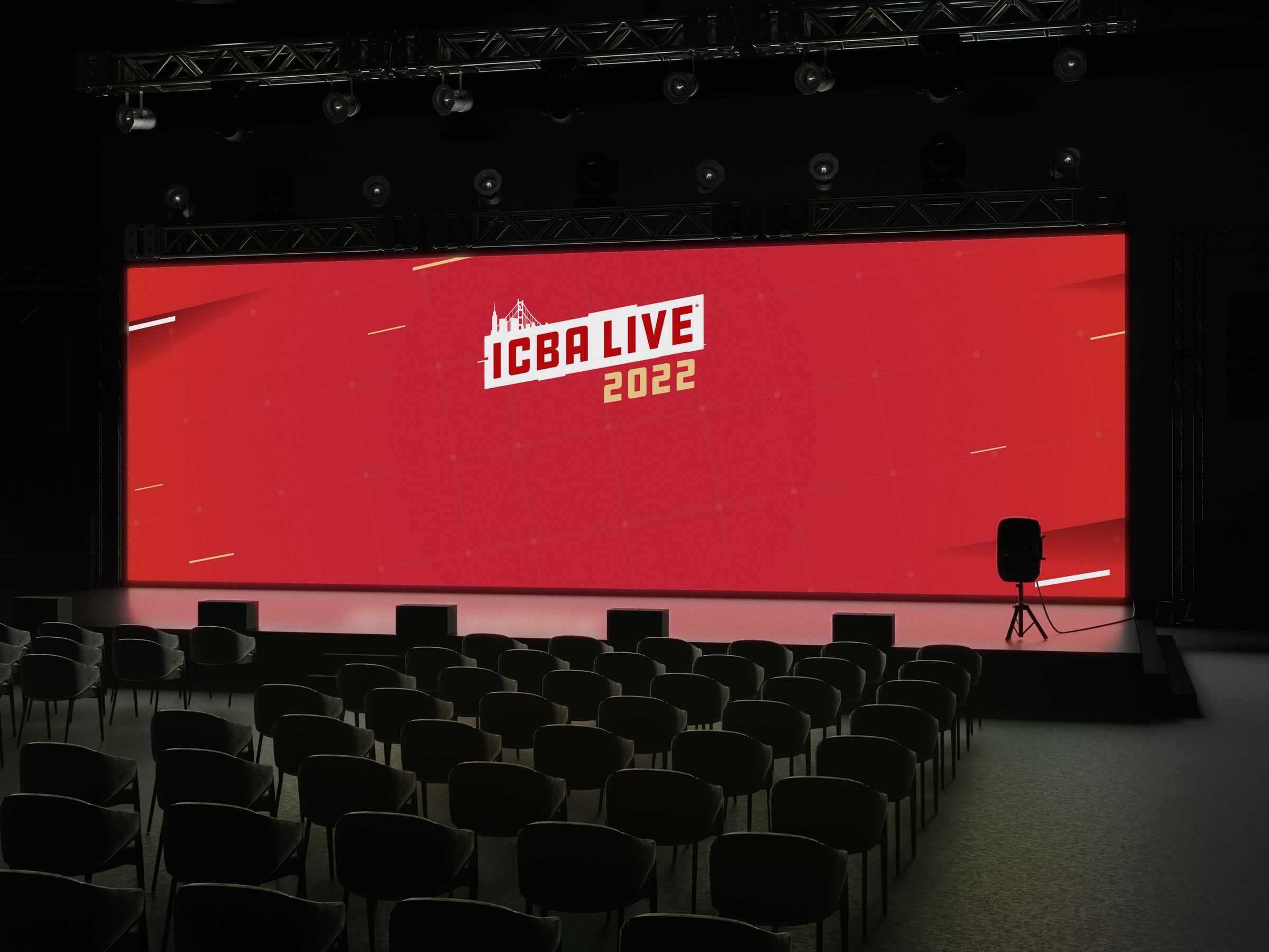
Three identities for the yearly convention of America’s community banks: one for Hawaii, one for the year it had to move online, and one for San Francisco. Each one carried through everything around it, from badges and booklets to ads, mailers and the website.
Three years, three identities
ICBA is the national trade association for America’s community banks. Once a year it brings more than 2,500 community bankers together at ICBA LIVE, its convention, and each year’s convention gets its own theme and its own identity.
As the association’s only in-house designer, I came up with the theme for each event and designed everything that carried it: signage and stands, badges, magazine ads, mailers, booklets, presentations and the website. Every direction went to the events executives, who made the final call.
Then the pandemic took the 2021 convention off the calendar, and it had to become an online event, with breakout rooms, that could handle a convention-sized crowd.
ICBA LIVE 2021
Hawaii
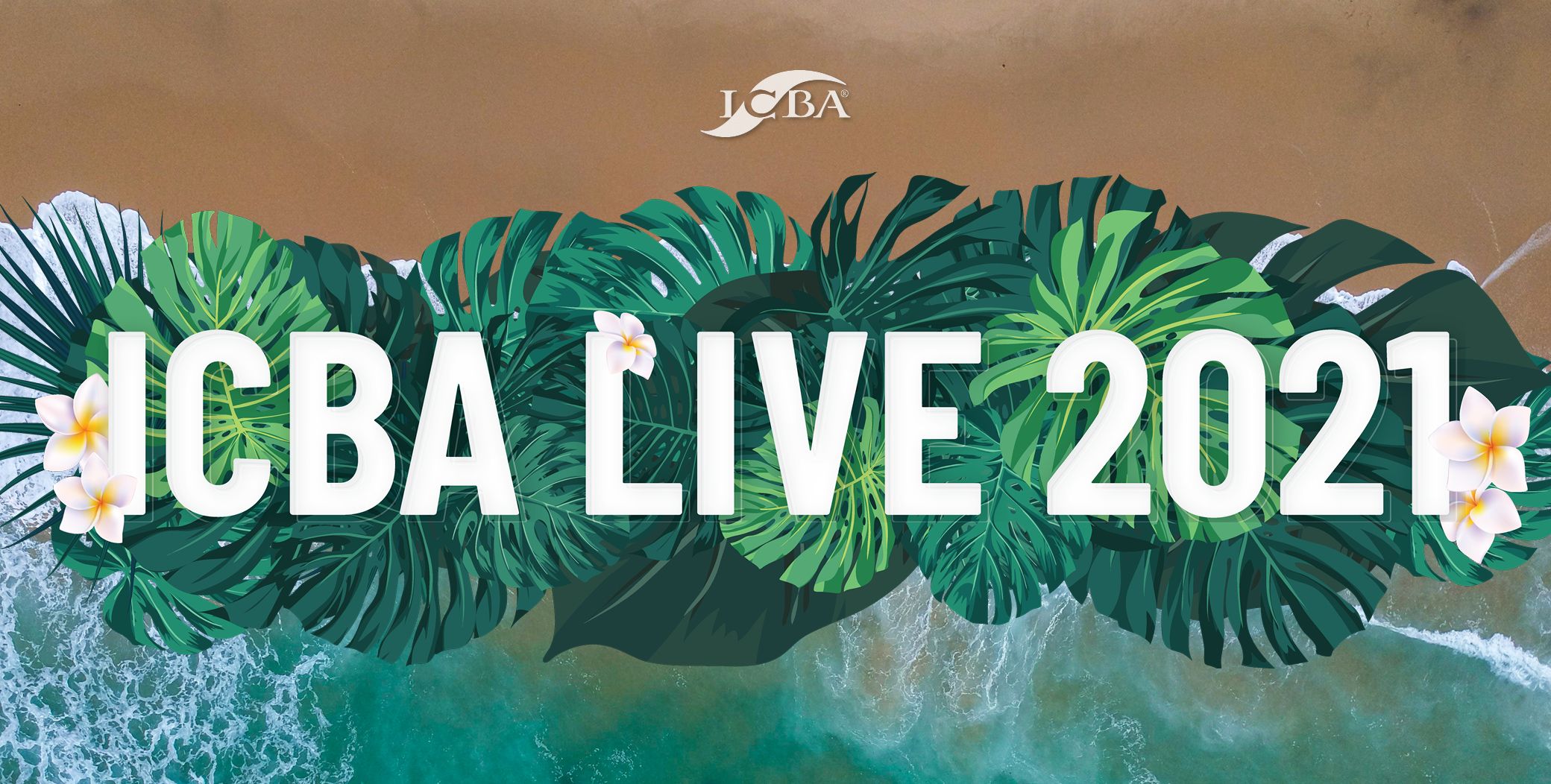
The line for 2021 was the rising tide of community banking, and Hawaii gave it a picture. The identity looks straight down on surf rolling in over the sand, so the tide is the first thing you see, with monstera leaves and plumeria framing the name to put you on the islands. Even the invitation took on the place: get in the Aloha spirit.
The 2021 convention never happened in person, but the identity didn’t go to waste. When ICBA LIVE finally went to Hawaii in 2023, it ran on this branding.
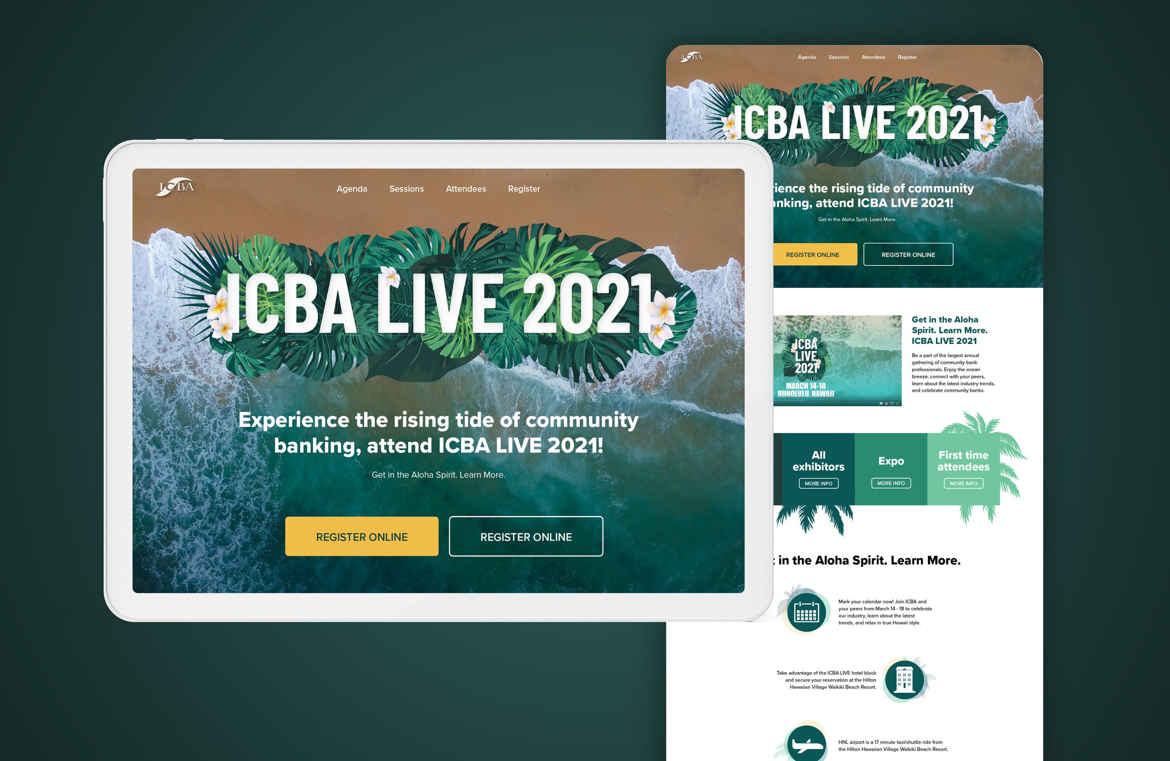
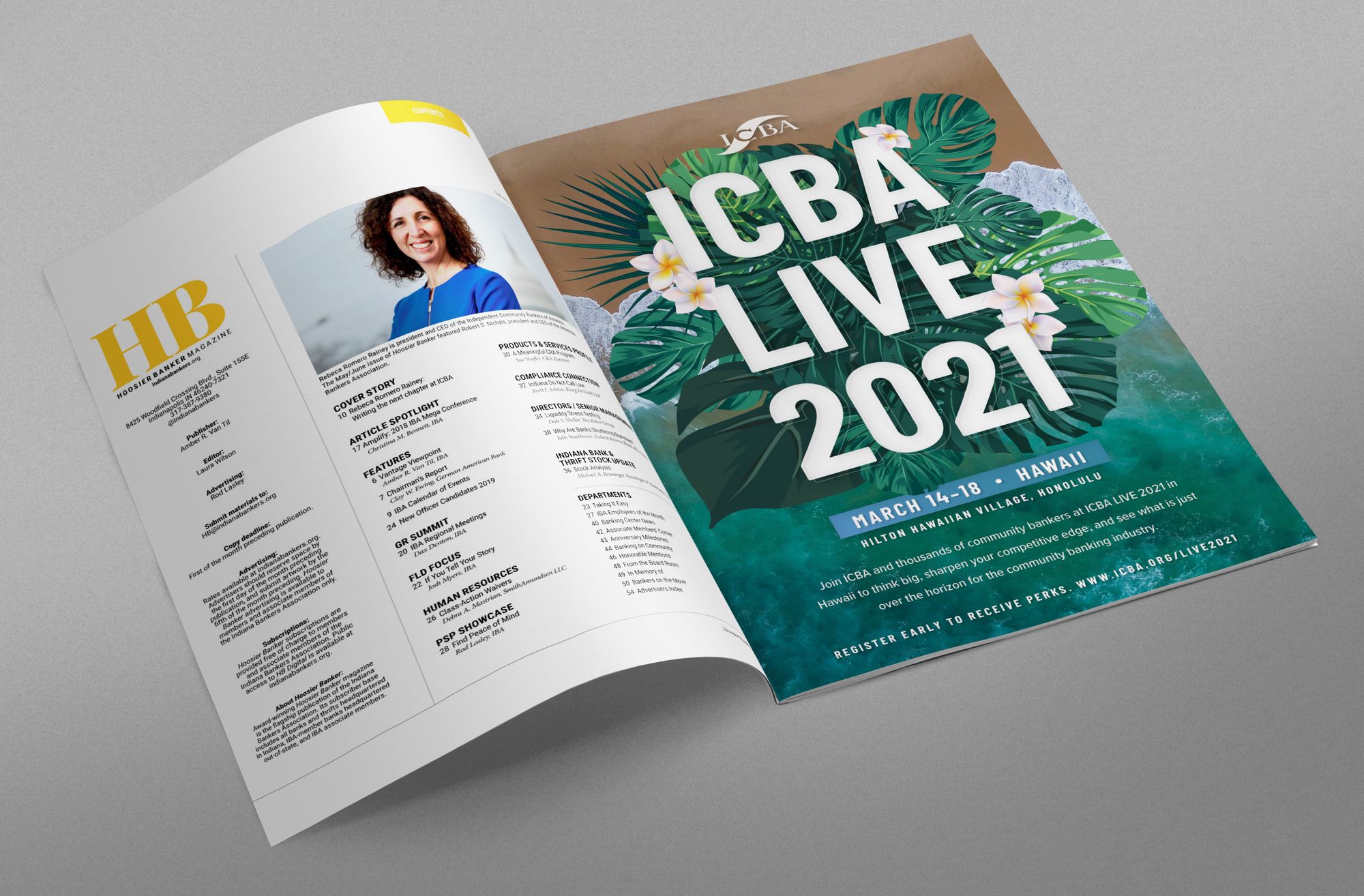
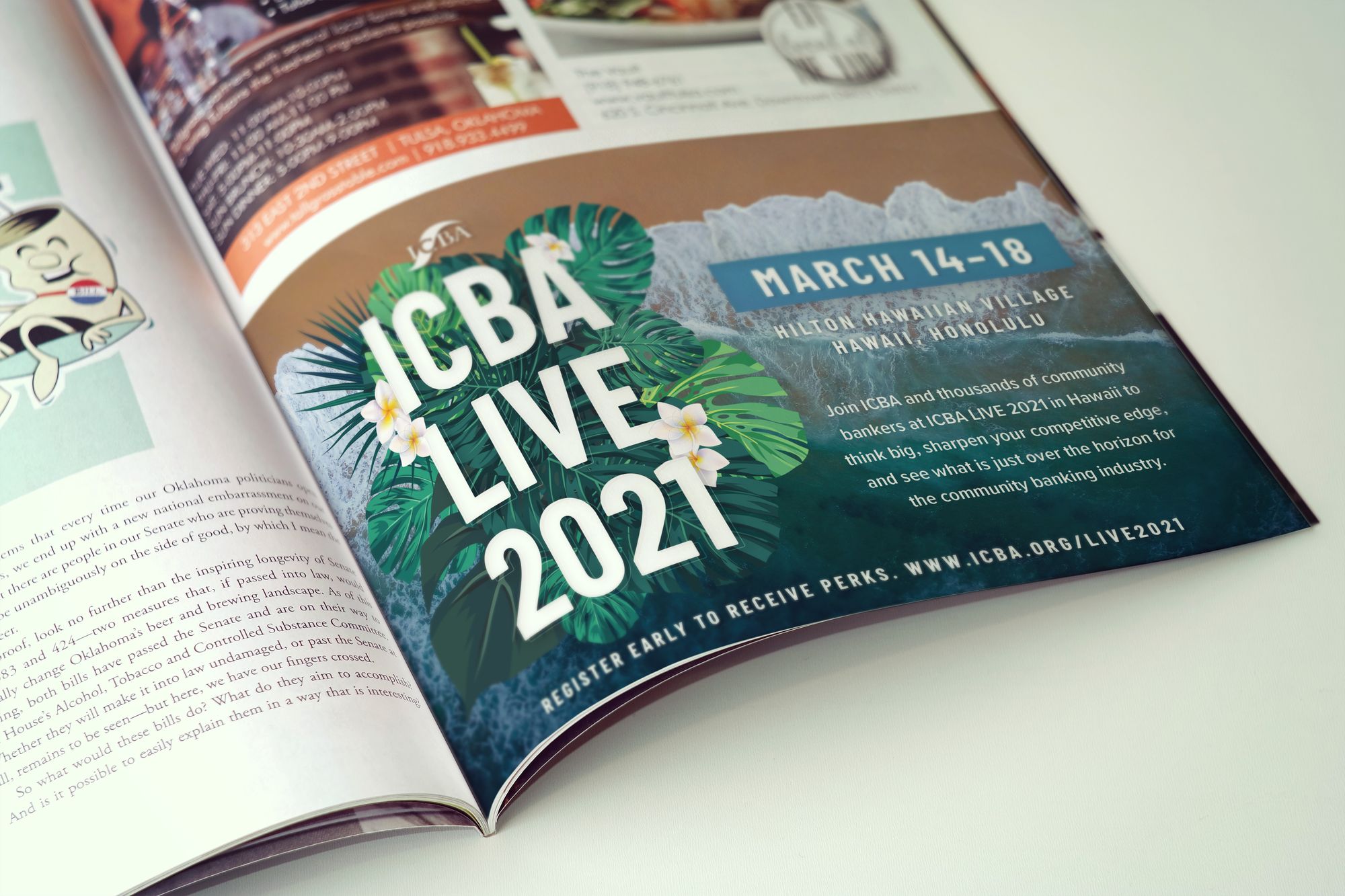
ICBA LIVE 2021The website, and full- and half-page ads in Independent Banker, ICBA’s magazine.
ICBA Connect
Online, 2021
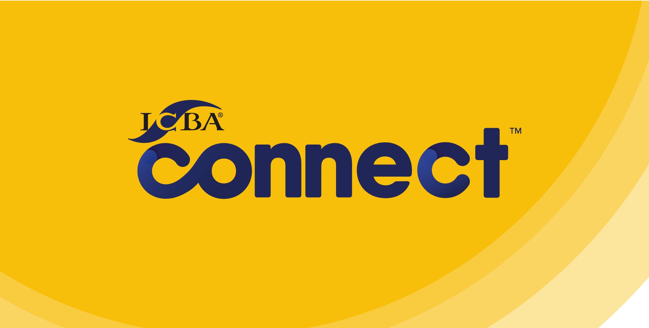
When the convention couldn’t happen in person, ICBA moved it fully online as ICBA Connect, and it needed an identity of its own. I built it on a warm, bright yellow and illustrated graphics, to bring some brightness to a dark time.
Being online had its upside. The event could bring in speakers a convention might not have, Magic Johnson among them. And with everyone at home, we created extra printed pieces, the guidebook among them, and mailed them to every attendee, to add something tangible to a time when people were apart.
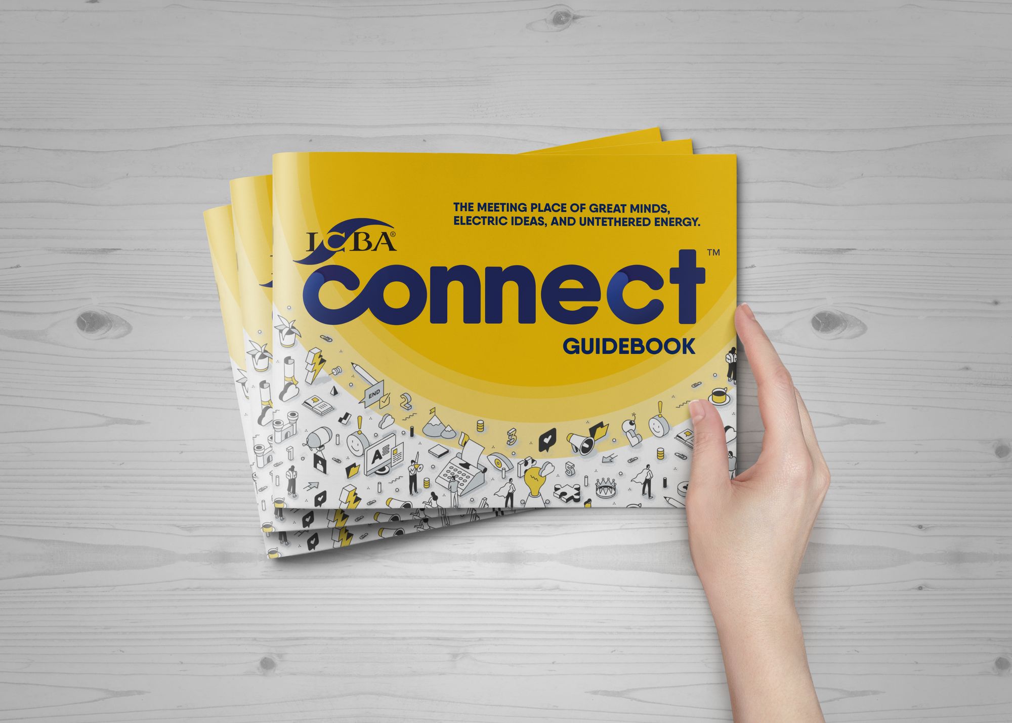
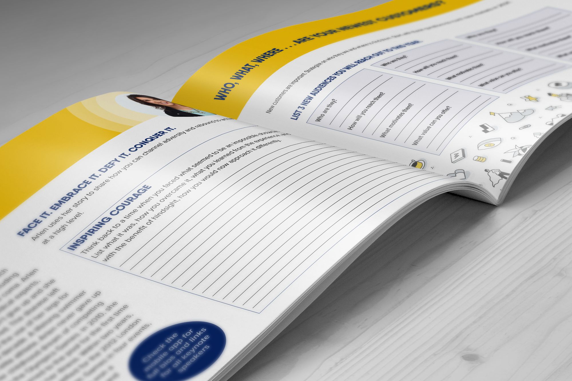
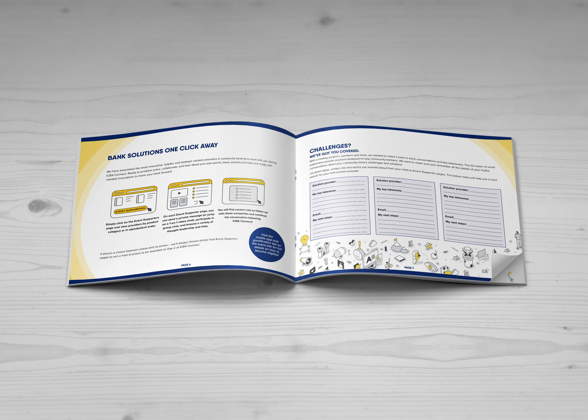
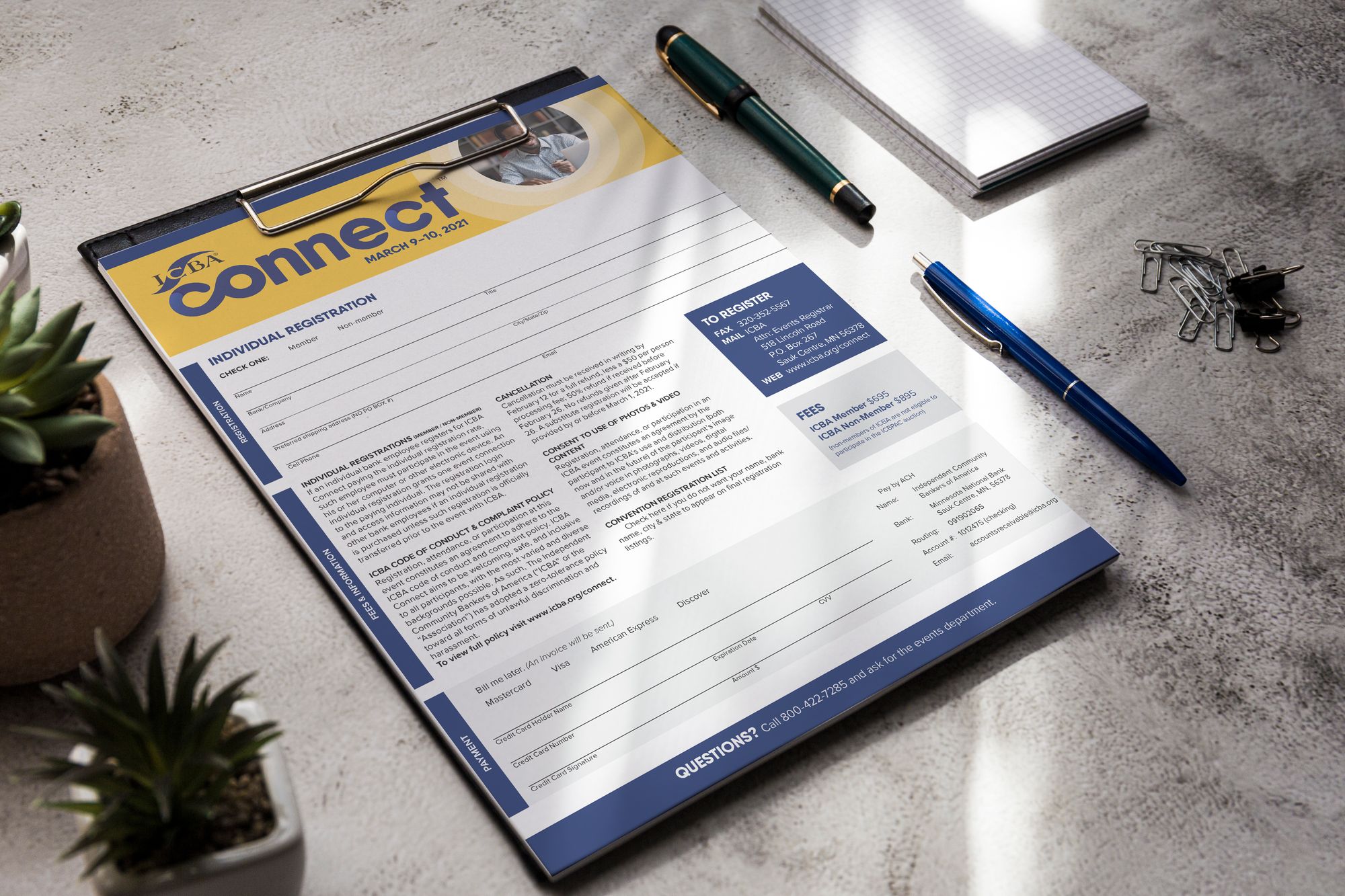
ICBA ConnectThe guidebook, mailed to every attendee to follow along at home, and the registration form.
ICBA LIVE 2022
San Francisco, then San Antonio
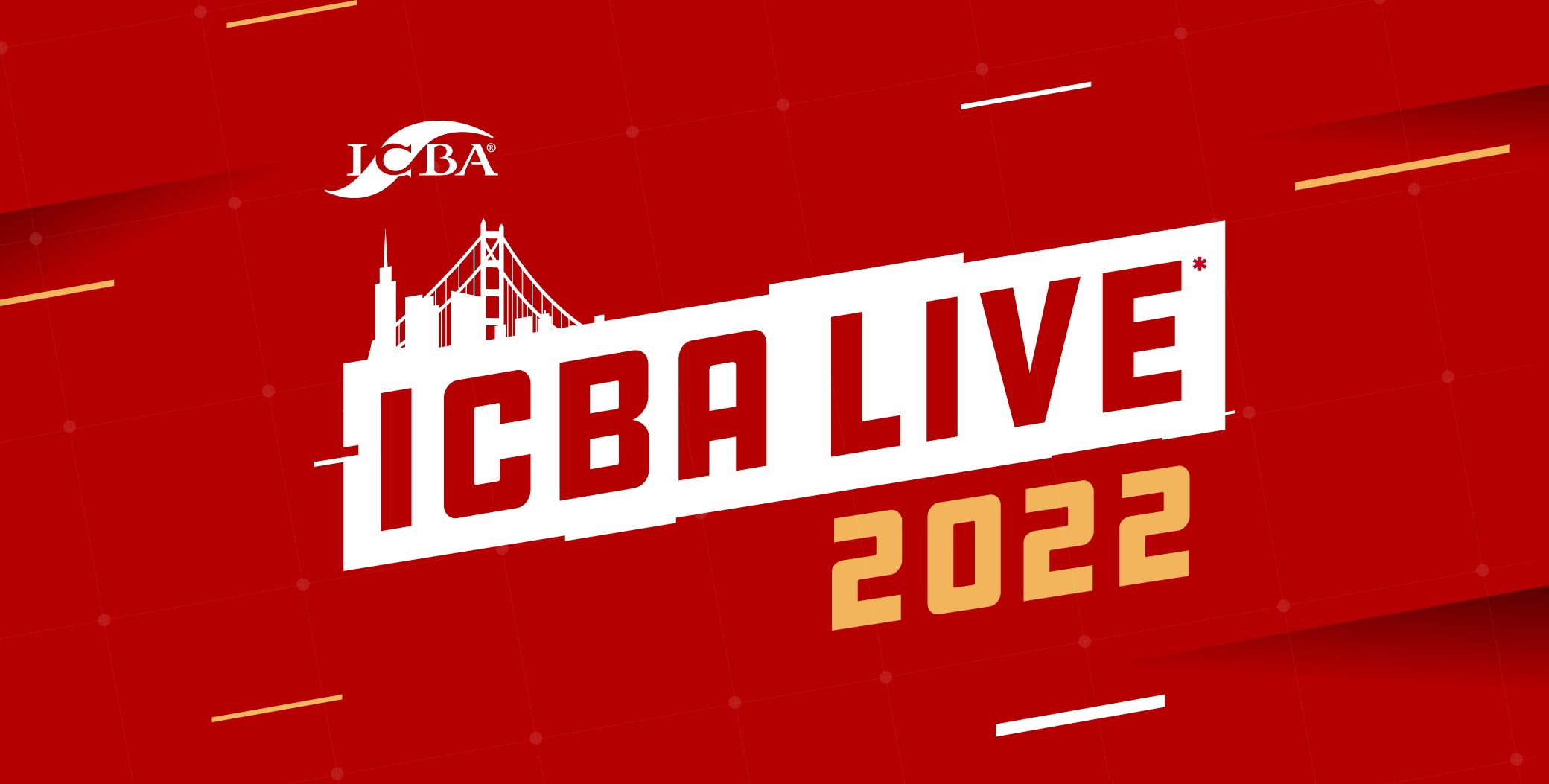
Built for San Francisco, and for the convention’s return to the room after a year online. The asterisk on LIVE says it: yes, in person. The red is the Golden Gate Bridge’s, the slanted wordmark and streaks of light carry the energy of everyone getting back together, and the bridge and skyline rise out of the name, cut into the top edge of the mailer so the city is the first thing you see.
Then the convention moved to San Antonio. The identity went with it, with a few small tweaks.
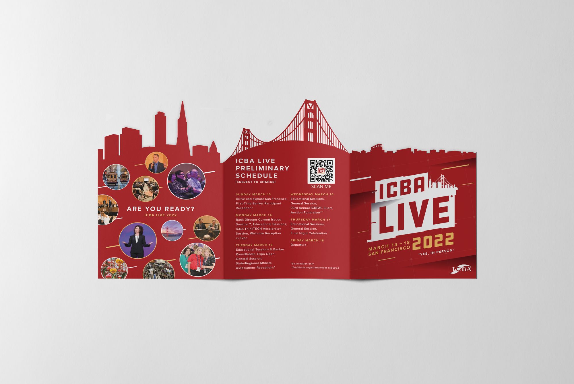
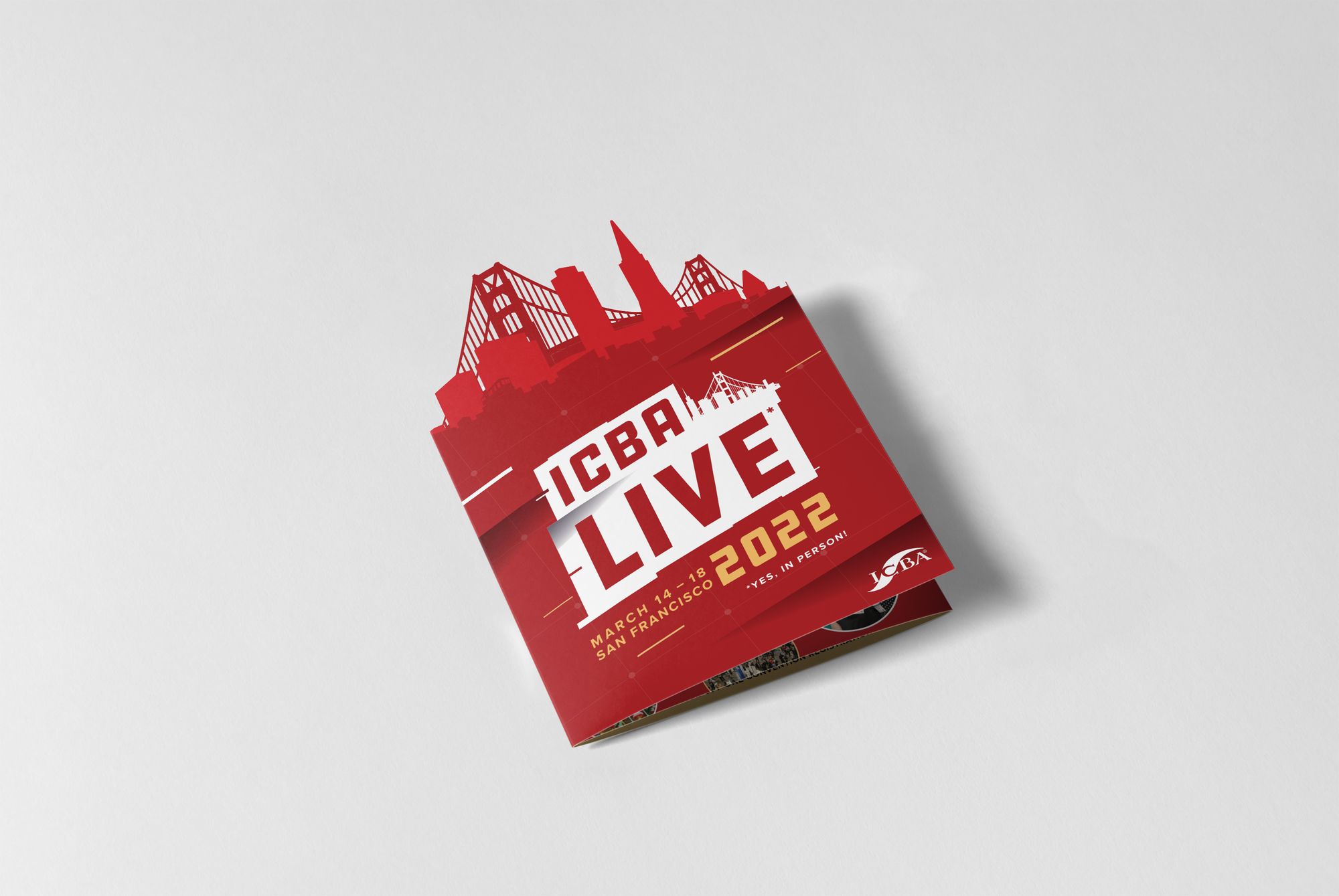
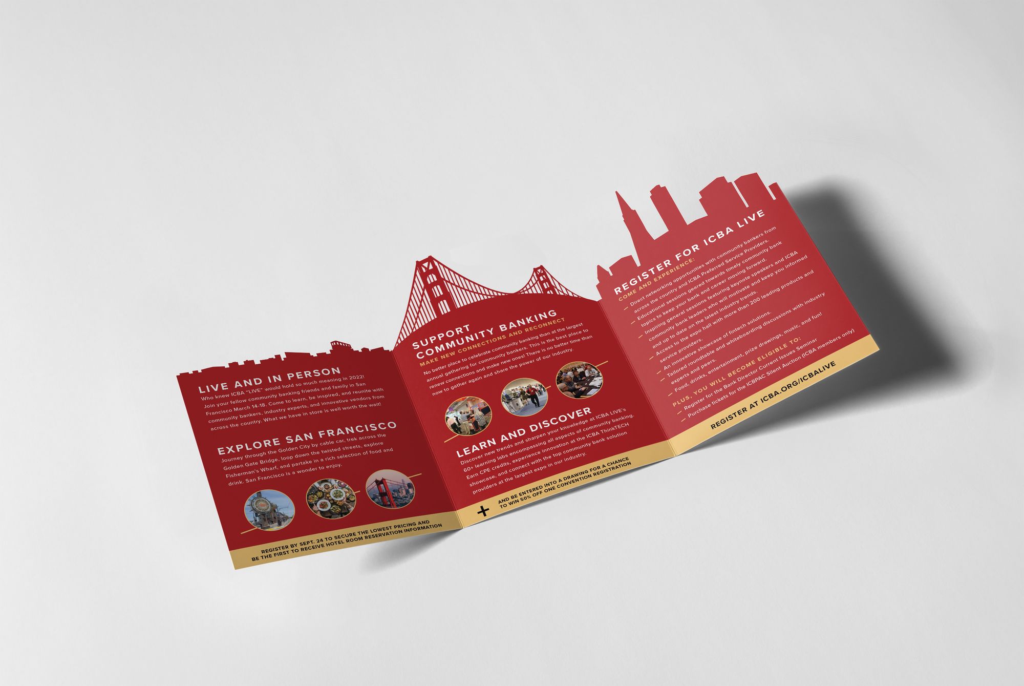
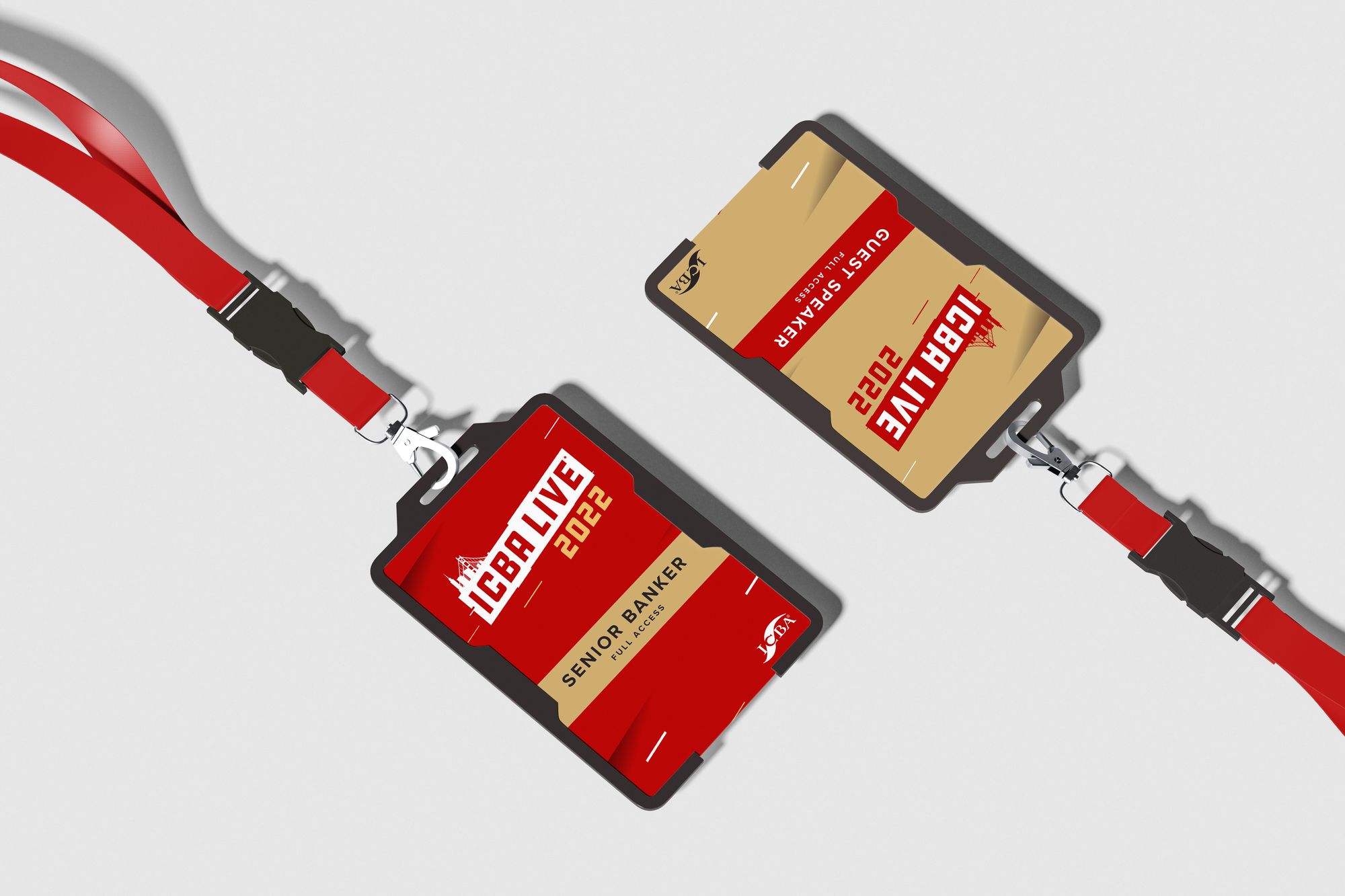
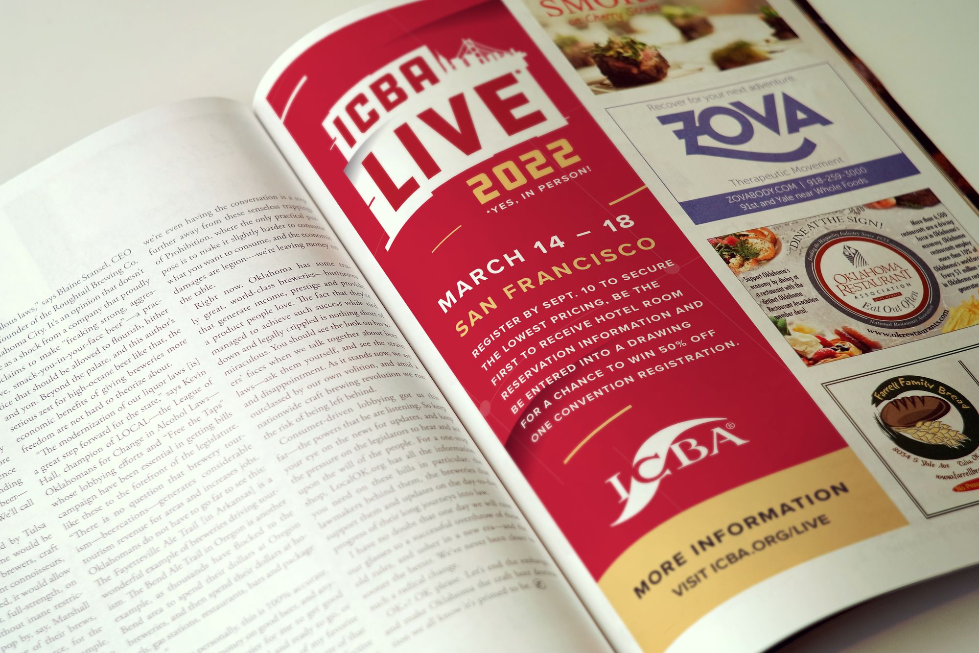
ICBA LIVE 2022The mailer with its die-cut San Francisco skyline, badges and lanyards, and a magazine ad, all from before the move.
Next
KLIK — founding the creative side of Adweek’s third fastest-growing agency.
Read the case study →