The solution
Moving the report off the web
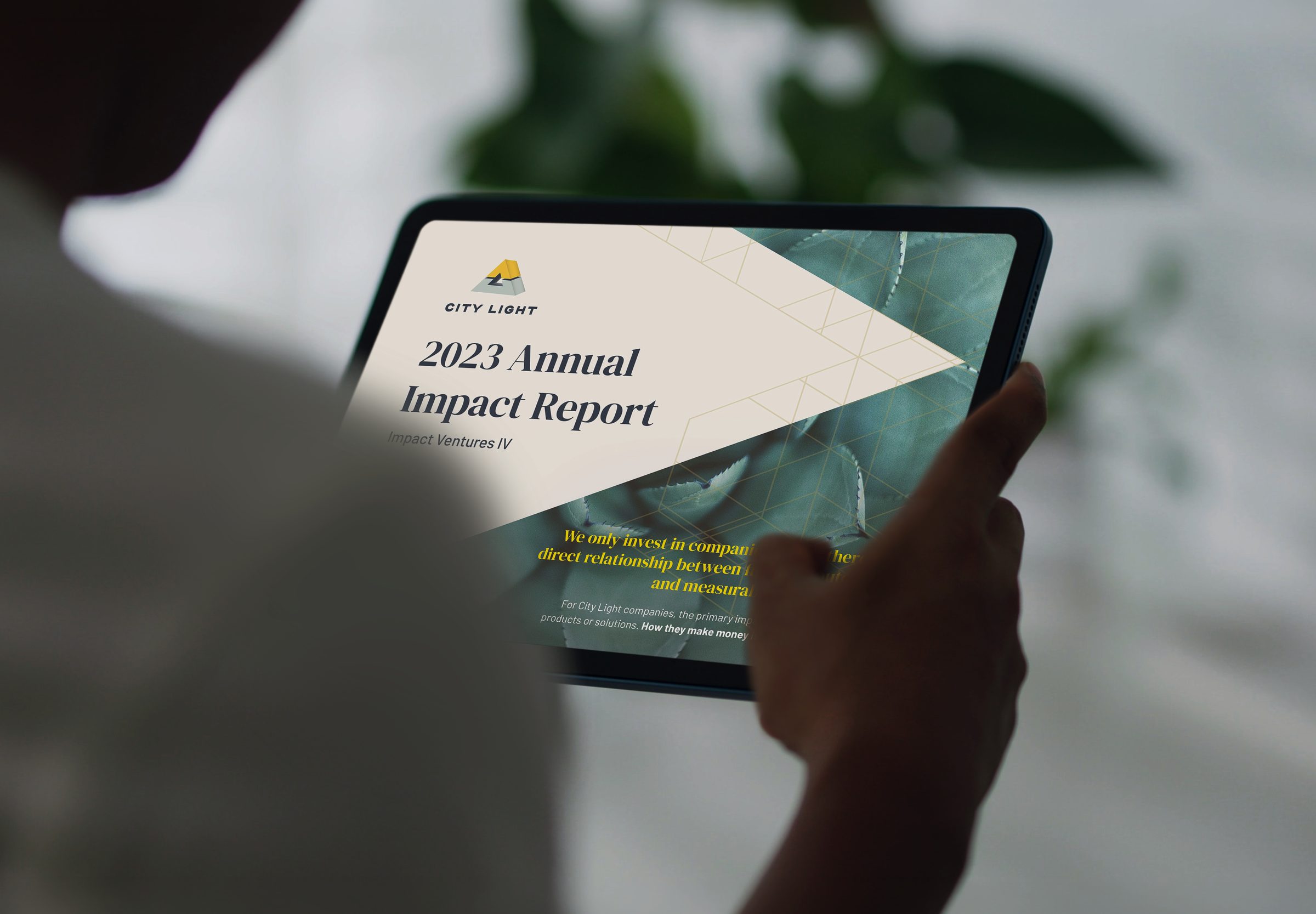
The annual impact report had been living as a poorly functioning web page, and one
that was a challenge for the team to maintain. Moving it to a designed PDF follows how
these documents are actually used — forwarded, annotated, read on a
plane, pulled up in a meeting. It is the industry standard for that reason, and it
gives the report the authority of a document an investor keeps.
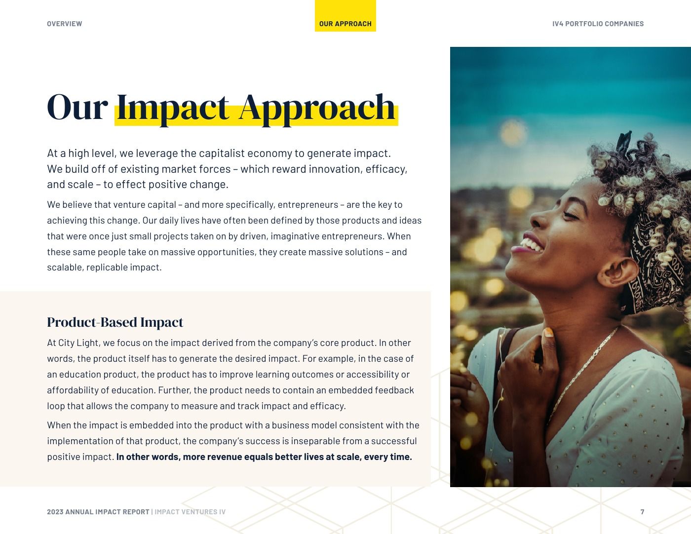
A serif, but not that serif
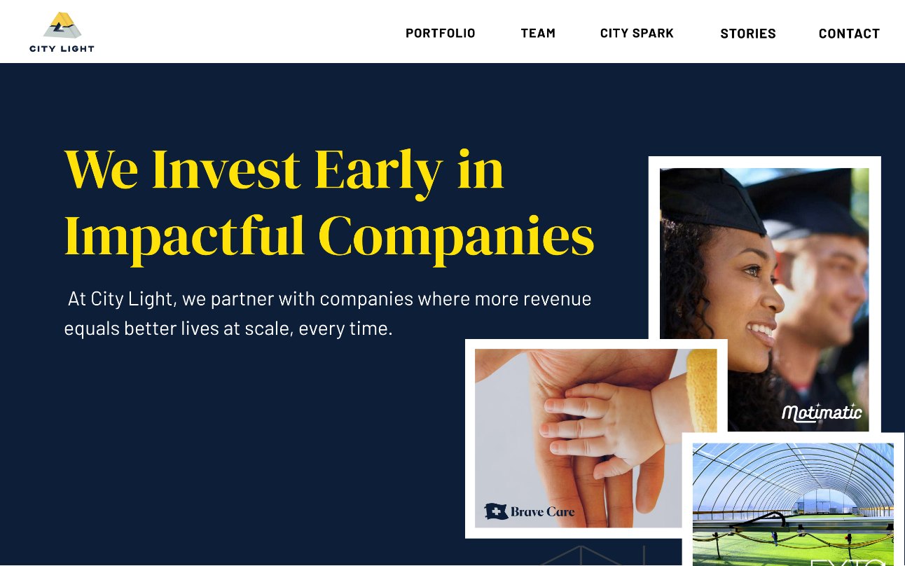
Typography is where the credibility had to come from. The expected move was the
classic finance look, but it would have erased exactly what made City Light worth
backing. The face carries weight and a certain
grandeur while staying modern, so the firm reads as substantial without reading as
conventional.
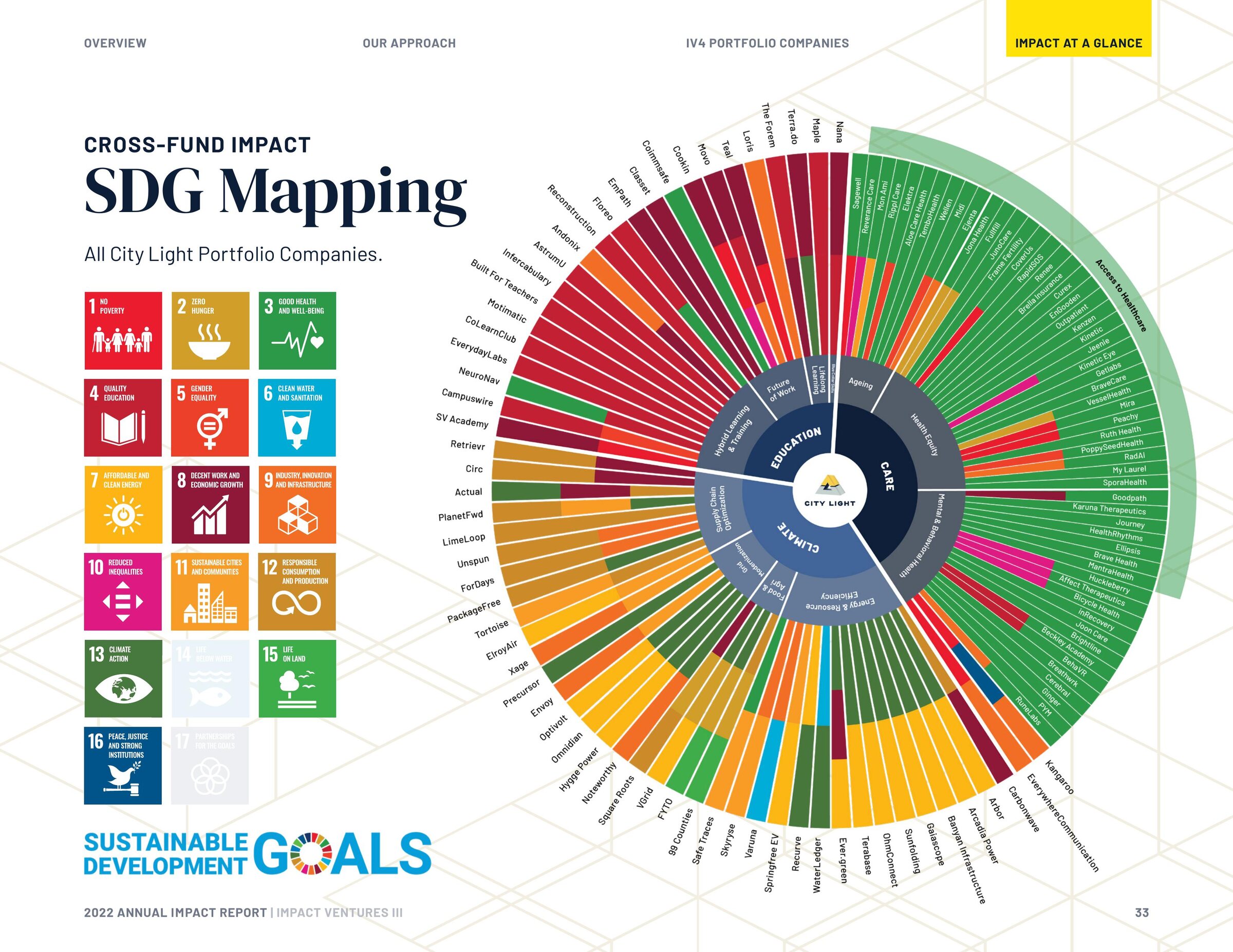
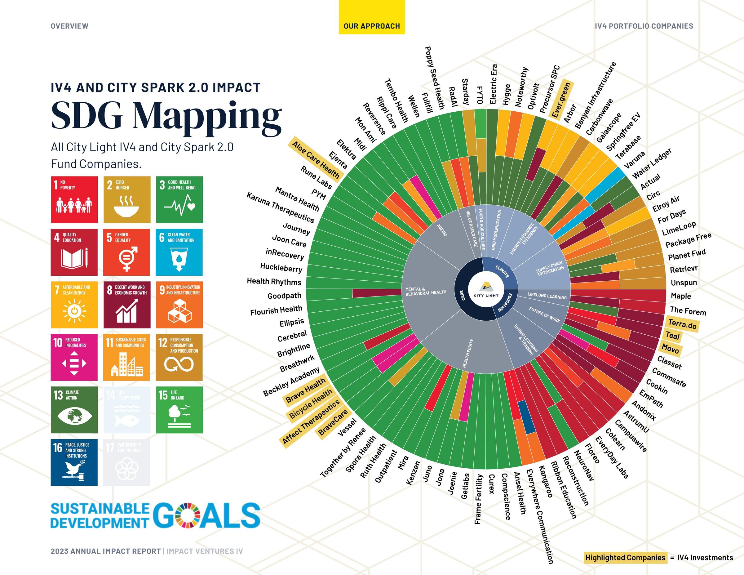
The data was the real design problem
Finance is literal, and in plenty of places it has to be. But an impact report is
a story about where money went and what it did, and the story needed room to come through.
I went through every fund and portfolio company, took in everything they gave me,
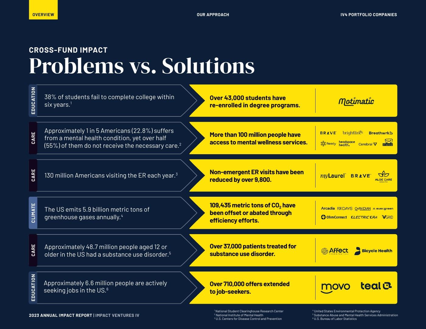
and distilled it to what carried the story. Then I laid it out for how it
gets read — which is not front to back. Most readers of these documents come
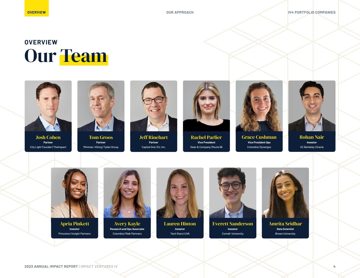
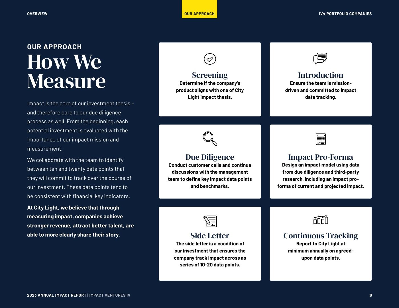
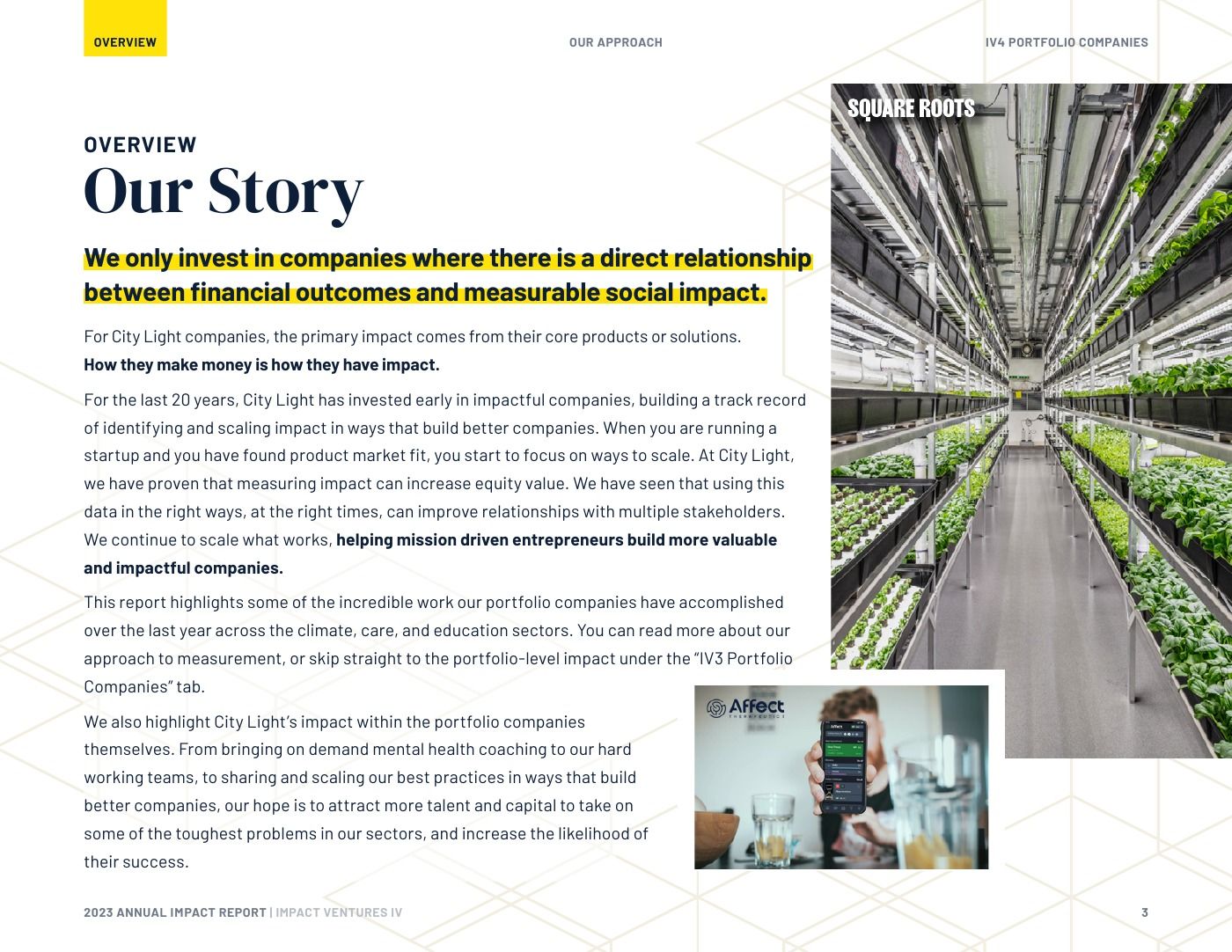
looking for one specific thing. So a running tab bar sits at the head of every
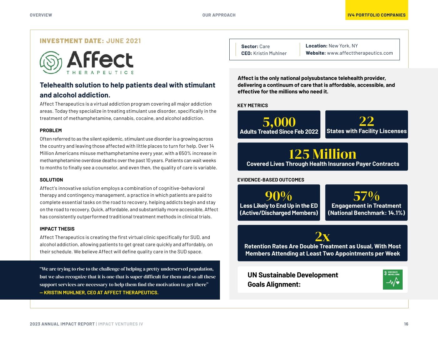
page and marks where you are, the figures resolve at a glance, and the argument is
still intact for anyone who reads the whole thing.
Scannable, in other words, without being thin.
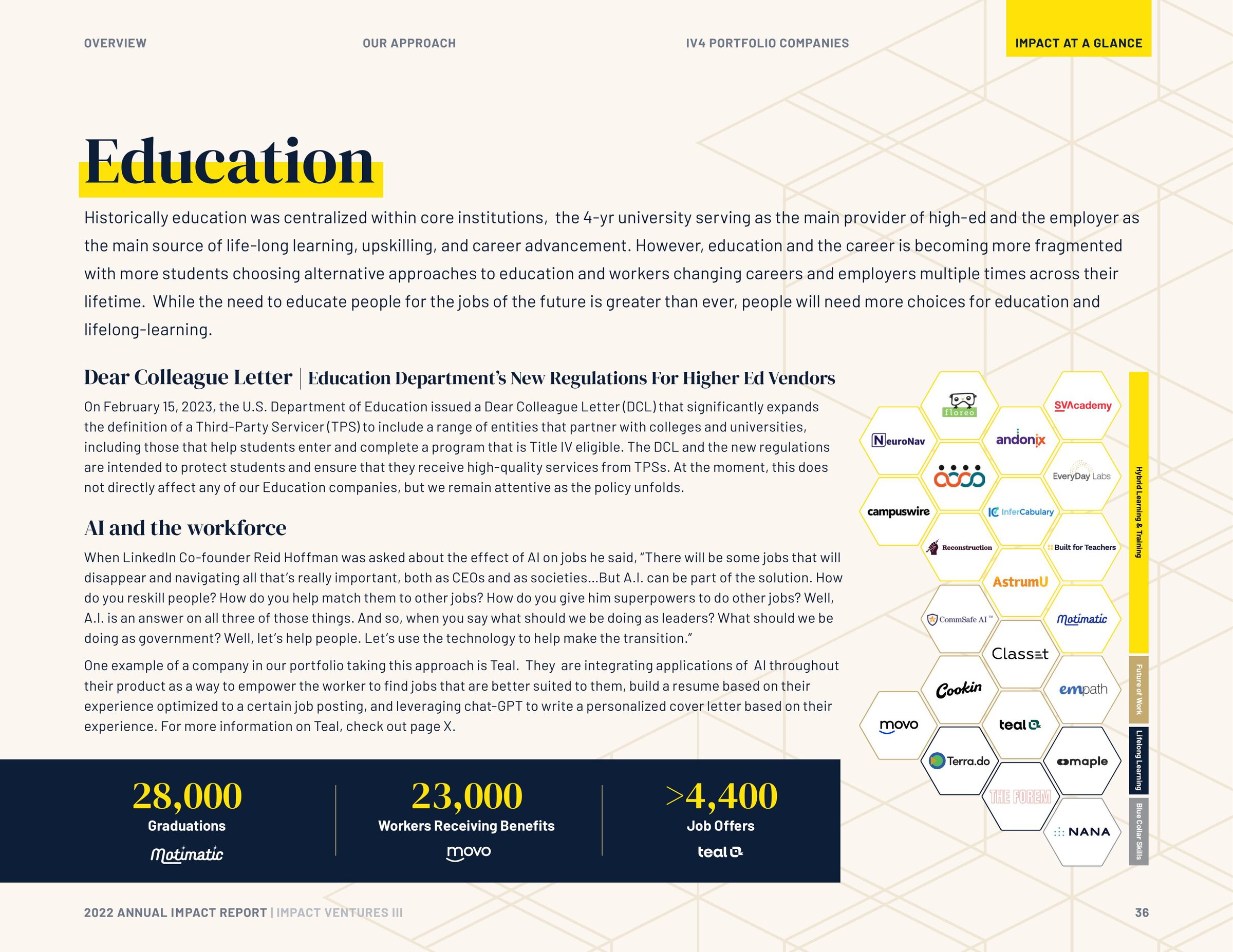
Modernizing around the mark
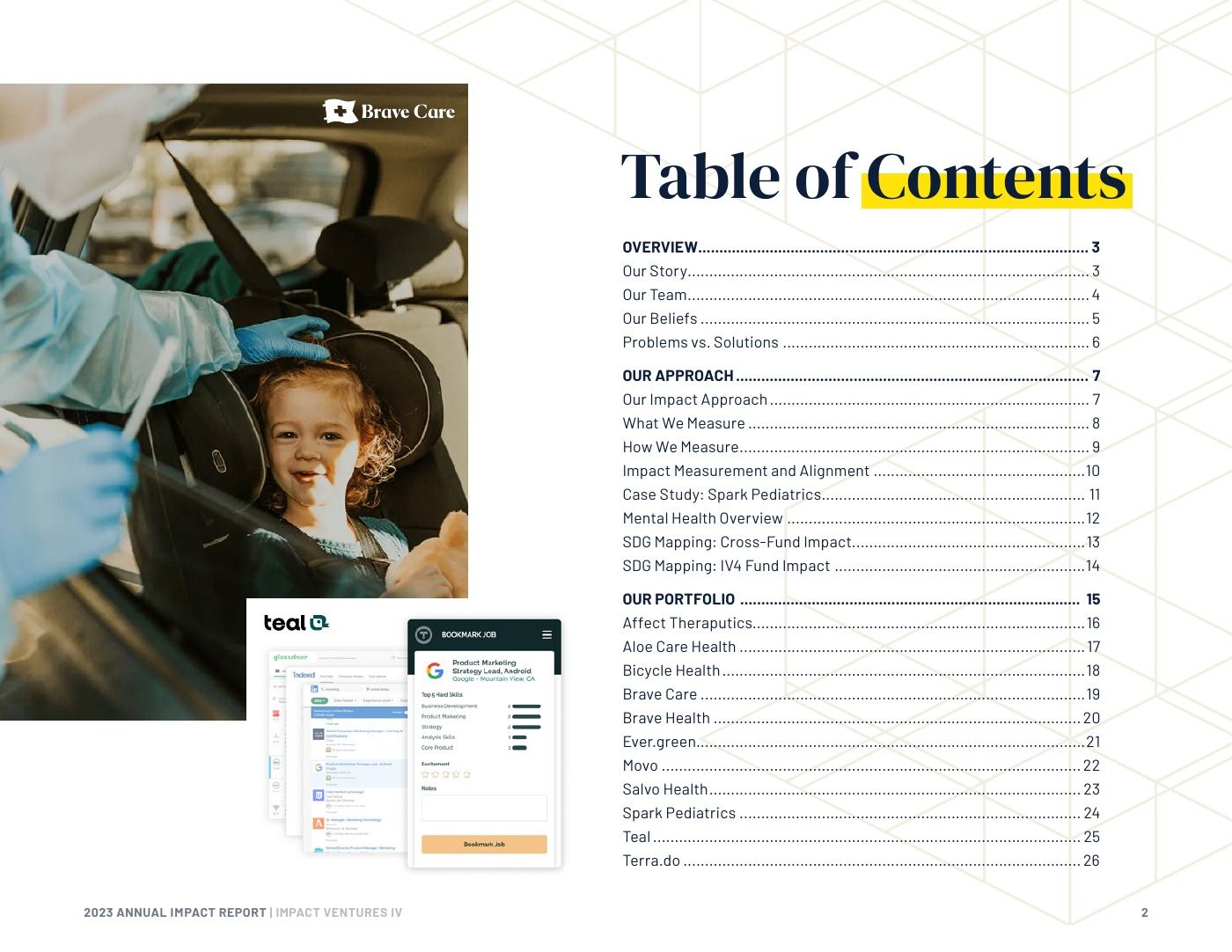
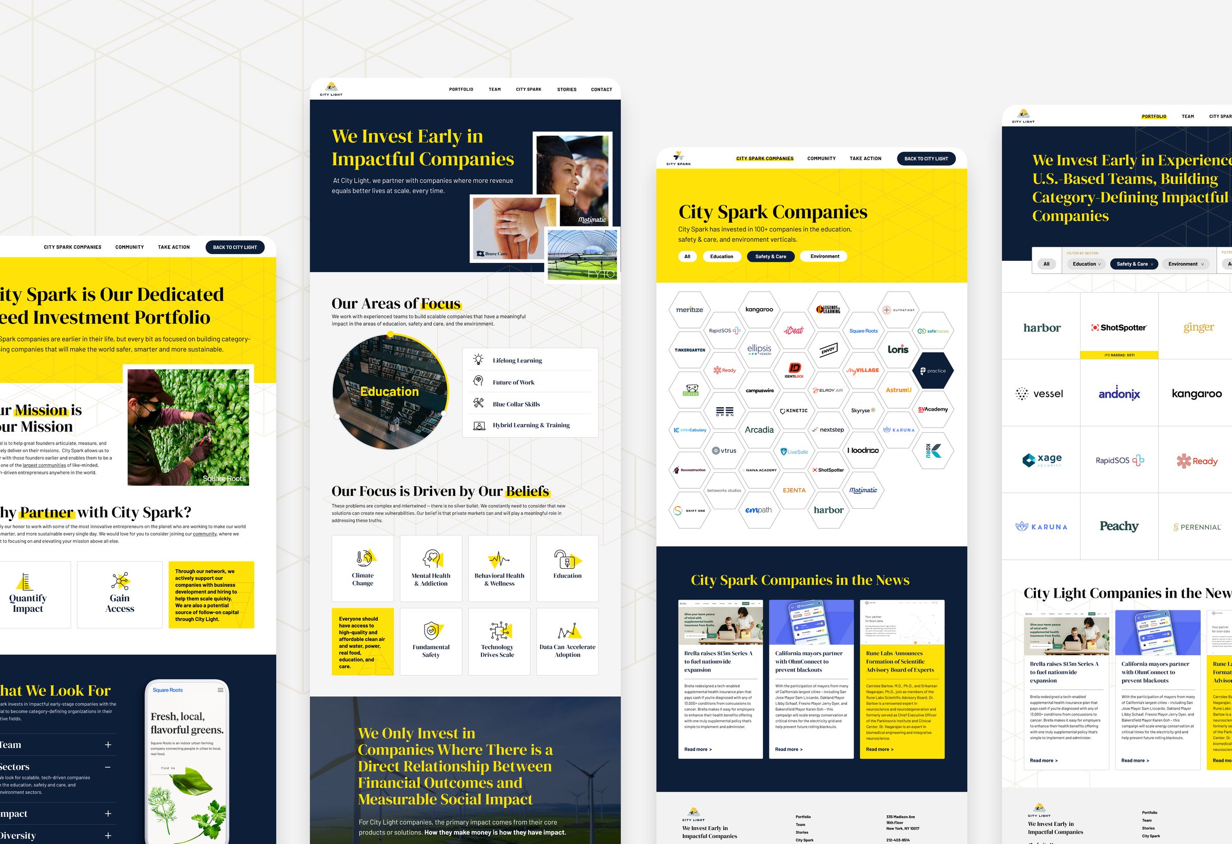
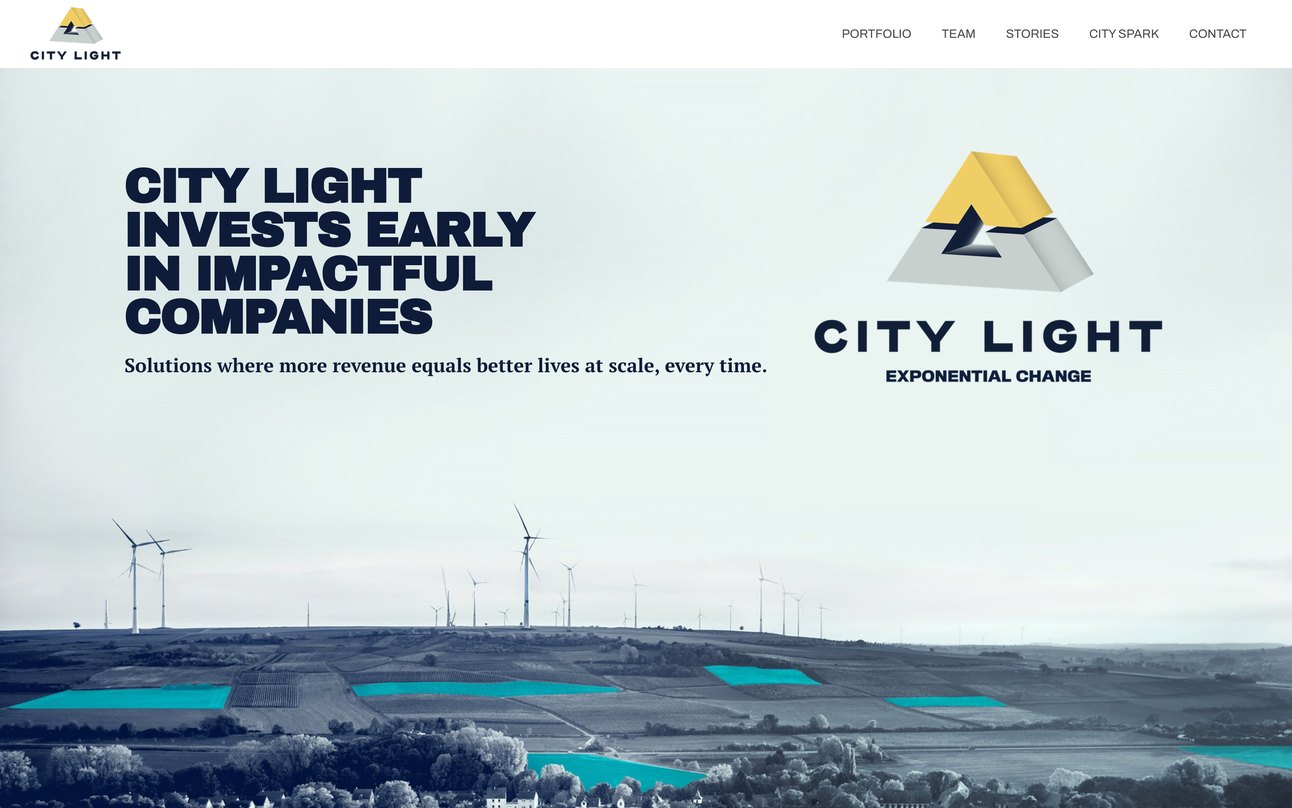
City Light kept its existing mark, a shaded, three-dimensional logo. I built a flat
isometric system around it —
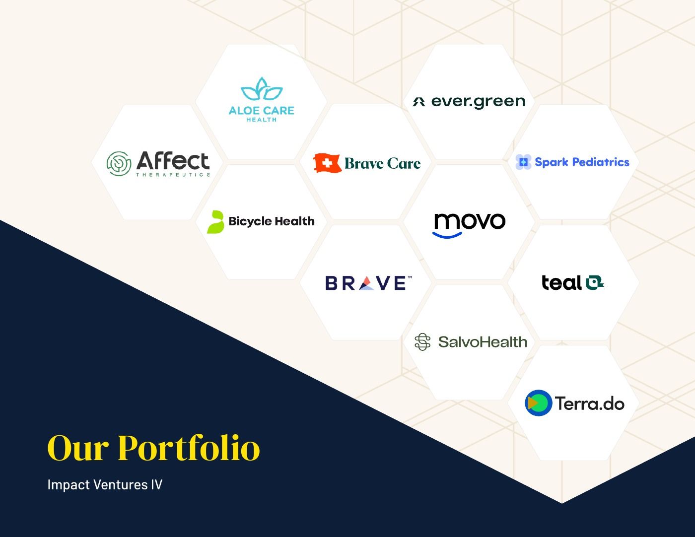
hexagons and linework that pick up the logo’s geometry and resolve it into
something current.
The team was unsure at first, a flat system beside a dimensional logo is an unusual
pairing. I made the case that the contrast was the point, carrying the brand forward
while the logo stayed recognizable. The hexagons became the part of the system they
valued most.